Statgraphics Centurion 18 was released in 2017. Some of the most important additions were the ability to handle Big Data, procedures for equivalence and noninferiority testing, orthogonal regression for situations when both Y and X are measured with error, and an interface to the R statistical computing language.
To discover what Statgraphics 18 added: click on the links below, check out the statistical capabilities listed in the left sidebar, or simply scroll through this page.
| 1. Version 18 Additions and Enhancements - an extensive discussion of the many new features. 2. What's New in Statgraphics 18 - a summary of the new features. 3. Version 18 Contents - a complete list of all statistical tests and procedures available in Statgraphics 18. 4. Version 18 Brochure - a six-page color brochure describing Statgraphics 18. |
 |
Version 18 Enhancements
|
Statgraphics 18 is a major upgrade that contains many new features, including:
|

New Features and Enhancements |
Attribute Capability Analysis StatletThis Statlet performs a capability analysis using attribute data. The data may consist of either the number of nonconforming items in a sample or the total number of nonconformities if an item can have more than one nonconformity. The analysis is based on either the binomial or the Poisson distribution.The Statlet will calculate parameter estimates and confidence limits or upper confidence bounds, capability indices (at both the best estimate and the upper bound), and DPM (defects per million). The analysis may be based on either a classical or Bayesian approach. Watch videos: classical methods or Bayesian methods
|
Big DataTo handle big data, a special file type called a Statgraphics Big Data file has been developed. These files have the extension .sgb rather than .sgd. They differ in 2 important ways from standard Statgraphics data files:
Using SGB files, Statgraphics is capable of analyzing data sets consisting of many millions of records and thousands of columns. SGB files may only be accessed by the 64-bit version of Statgraphics 18. Watch video
|
Bivariate Density StatletThe Bivariate Density Statlet displays the estimated density function for 2 columns of numeric data. It does so using either a 2-dimensional contour plot or a 3-dimensional frequency histogram. The joint distribution of the 2 variables may either be assumed to be multivariate normal or be estimated using a nonparametric approach. Watch video
|
Butterfly PlotThe Butterfly Plot compares 2 samples of attribute data. It consists of 2 sets of bars that show the frequency distribution of each sample over a set of categories. Watch video
|
Capability Control ChartsThis procedure constructs Phase II statistical process control charts for monitoring capability indices such as Cp and Cpk. Given a process that is deemed to be capable of satisfying stated requirements based on the analysis of variable data, these charts monitor continued compliance with those requirements. Watch video
|
Capability Control Chart Design StatletThis new Statlet assists analysts in determining how large samples should be when constructing capability control charts. Capability control charts monitor processes which have been shown to be stable and capable of producing results that yield small numbers of nonconformities. Watch video
|
Classification and Regression TreesThe Classification and Regression Trees procedure implements a machine-learning process to predict observations from data. It creates models of 2 forms: classification models and regression models.The models are constructed by creating a tree, each node of which corresponds to a binary decision. Given a particular observation, one travels down the branches of the tree until a terminating leaf is found. Each leaf of the tree is associated with a predicted class or value. Watch classfication trees video. Watch regression trees video.
|
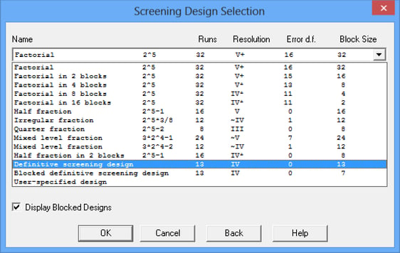
Definitive Screening DesignsA new type of experimental design has been added to the Design of Experiments Wizard. Called Definitive Screening Designs, these designs are small designs capable of estimating models involving both linear and quadratic effects, although second-order interactions are partially confounded with themselves and with quadratic effects. In addition, designs for 6 or more factors collapse into designs which can estimate the full second-order model (including interactions) for any 3 factors. Watch video
|
Demographic Map VisualizerThis new Statlet is designed to illustrate changes in location statistics over time. Given data at each of k locations during p time periods, the program generates a dynamic display that illustrates how the data have changed at each location. The data at each location is drawn using a bubble whose size is proportional to the observed data value. SHP files may also now be used to draw boundaries. Watch video
|
Diamond PlotThe Diamond Plot procedure creates a plot for a single quantitative variable showing the n sample observations together with a confidence interval for the population mean. A separate procedure plots multiple diamond plots for grouped data. Watch video
|
Distribution Fitting for Arbitrarily Censored DataThis procedure analyzes data in which one or more observations are not known exactly. In particular, observations may be right-censored, left-censored, interval-censored, or a combination of all three types. The procedure calculates summary statistics, fits distributions, creates graphs, and calculates a nonparametric estimate of the survival function. Watch video
|
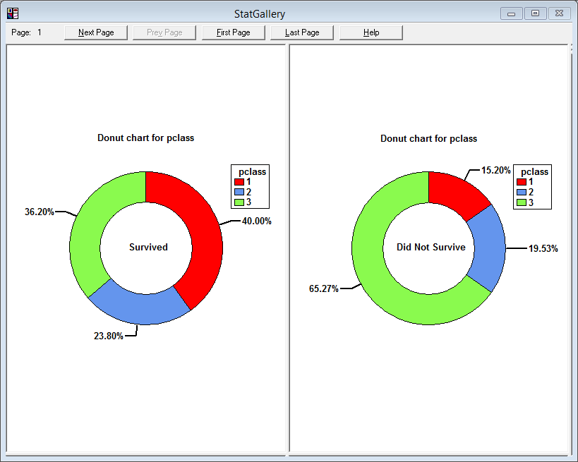
Donut ChartThe donut chart is an alternative to the piechart. It is similar to the piechart except that the center is removed. Watch video
|
Equivalence and Noninferiority TestsFour new procedures have been added to demonstrate equivalence (two-sided) or noninferiority (one-sided). They are used to compare 2 independent means, compare 2 paired means, compare a single mean against a target value, and analyze the results of a 2x2 crossover study. Unlike standard hypothesis tests which are designed to prove superiority of one method over another, equivalence tests are designed to prove that two methods have essentially the same mean. Watch videos Part1: 2 Independent Samples, Part 2: 2x2 Crossover Studies
|
Heat MapThis procedure shows the distribution of a quantitative variable over all combinations of 2 categorical factors. If one of the 2 factors represents time, then the evolution of the variable can be easily viewed using the map. A gradient color scale is used to represent values of the quantitative variable. Watch video
|
Likert PlotThe Likert Plot procedure analyzes data recorded on a Likert scale. Likert scales are commonly used in survey research to record user responses to a statement. A typical 5-level Likert scale might code user responses from strongly disagree to strongly agree.This analysis calculates summary statistics and displays the results using a diverging stacked barchart. Watch video
|
Monte Carlo Simulation - Sensitivity Tornado PlotThis plot shows the effect of each input variable on a response when it is changed over a specified percentage of its probability distribution, with all other variables held at their median values. The variables are sorted from top to bottom in order of their overall effect. Watch video
|
Multidimensional ScalingThe Multidimensional Scaling procedure is designed to display multivariate data in a low-dimensional space. Given an n by n matrix of distances between each pair of n multivariate observations, the procedure searches for a low-dimensional representation of those observations that preserves the distances between them as well as possible. The primary output is a map of the points in that low-dimensional space (usually 2 or 3 dimensions). Calculations are performed by R using the “cmdscale” and “isoMDS” functions. Watch video
|
Multivariate Normal Random NumbersThis procedure generates random numbers from a multivariate normal distribution involving up to 12 variables. The user inputs the variable means, standard deviations, and the correlation matrix. Random samples are generated which may be saved to the Statgraphics databook. Watch video
|
Multivariate Normality TestThis procedure tests whether a set of random variables could reasonably have come from a multivariate normal distribution. It includes Royston’s H test and tests based on a chi-square plot of the squared distances of each observation from the sample centroid. Watch video
|
Multivariate Tolerance LimitsThe Multivariate Tolerance Limits procedure creates statistical tolerance limits for data consisting of more than one variable. It includes a tolerance region that bounds a selected p% of the population with 100(1-a)% confidence. It also includes joint simultaneous tolerance limits for each of the variables using a Bonferroni approach. The data are assumed to be a random sample from a multivariate normal distribution. Multivariate tolerance limits are often compared to specifications for multiple variables to determine whether or not most of the population is within spec. Watch video
|
Orthogonal RegressionThis procedure is designed to construct a statistical model describing the impact of a single quantitative factor X on a dependent variable Y, when both X and Y are observed with error. Any of 27 linear and nonlinear models may be fit. Watch video
|
Population Pyramid StatletThe Population Pyramid Statlet is designed to compare the distribution of population counts (or similar values) between 2 groups. It may be used to display that distribution at a single point in time, or it may show changes over time in a dynamic manner. Watch video
|
Ribbon PlotThis new method for displaying response surfaces has been added to various procedures, including the DOE Wizard. Watch video
|
Sunflower Plot StatletThe Sunflower Plot Statlet is used to display an X-Y scatterplot when the number of observations is large. To avoid the problem of overplotting point symbols with large amounts of data, glyphs in the shape of sunflowers are used to display the number of observations in small regions of the X-Y space. Watch video
|
Text MiningA new dialog box-driven procedure uses the Statgraphics to R interface to implement text mining using the tm library. You can extract information from multiple text documents or analyze columns of character data already loaded into the Statgraphics datasheet. Watch video
|
Time Series Baseline PlotThis procedure plots a time series in sequential order, identifying points that are beyond lower and/or upper limits. It is widely used to plot monthly data such as the Oceanic Niño Index. Watch video
|
Tornado PlotThe Tornado Plot compares 2 samples of attribute data. It consists of 2 sets of bars that show the frequency distribution of each sample over a set of categories. Watch video
|
Trivariate Density StatletThe Trivariate Density Statlet displays the estimated density function for 3 columns of numeric data. It does so using either a 3-dimensional contour plot or a 3-dimensional mesh plot. The joint distribution of the 3 variables may either be assumed to be multivariate normal or be estimated using a nonparametric approach. Watch video
|
Violin PlotThe Violin Plot Statlet displays data for a single quantitative sample using a combination of a box-and-whisker plot and a nonparametric density estimator. It is very useful for visualizing the shape of the probability density function for the population from which the data came. A separate procedure plots multiple violin plots for grouped data. Watch video
|
Wind Rose StatletThe Wind Rose Statlet displays data on a circular plot, depicting the frequency distribution of variables such as wind speed and direction. It may be used to display the distribution at a single point in time, or it may show changes over time in a dynamic manner. Watch video
|
X-13ARIMA-SEATSThis procedure performs a seasonal adjustment of time series data using the procedure currently employed by the United States Census Bureau. As part of the procedure, the time series is decomposed into 3 components: trend-cycle, seasonality, and randomness. Each component may be plotted separately or saved, together with the seasonally adjusted data.The seasonal adjustment calculations are performed by the “seasonal” package in R. Watch video
|

© 2025 Statgraphics Technologies, Inc.
The Plains, Virginia
CONTACT US
Have you purchased Statgraphics Centurion or Sigma Express and need to download your copy?
CLICK HERE