COVID-19 Forecasting Models, Charts and Graphs from Statgraphics
August 25th, 2020
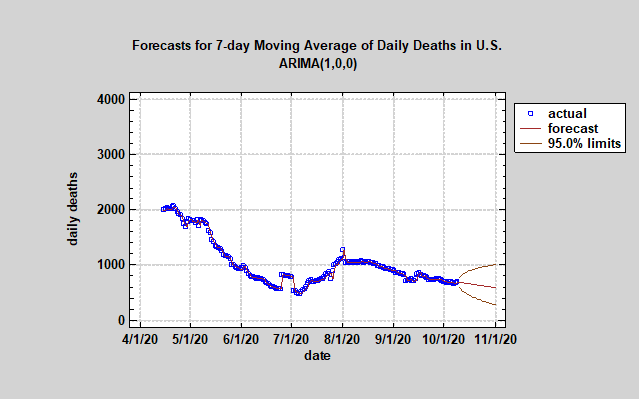
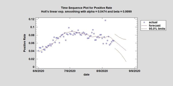
The battle against the pandemic in the United State of America continues. Although daily death projections have decreased from previous models, there are now some frightening forecasts. The number of people hospitalized currently, number of positives tests and the positivity rate have been increasing and show upward forecasting trends for the next two weeks (using data thru 10/9/2020). We will continue to monitor the daily numbers and hope that this uptick was caused by the laggard effect of people re-entering society. If proper hygiene and social distance measures are used, we could see the numbers start to flatten or decline once again. However, this potential second wave is occurring before the annual flu season begins which means things could get worse than our models. One positive from our models is that the number of daily deaths is forecast to decline. However, our models only use historical data and other factors such as the increased number of positive tests, the flu season, and a widely used vaccination will influence the actual numbers.
August 25th, 2020
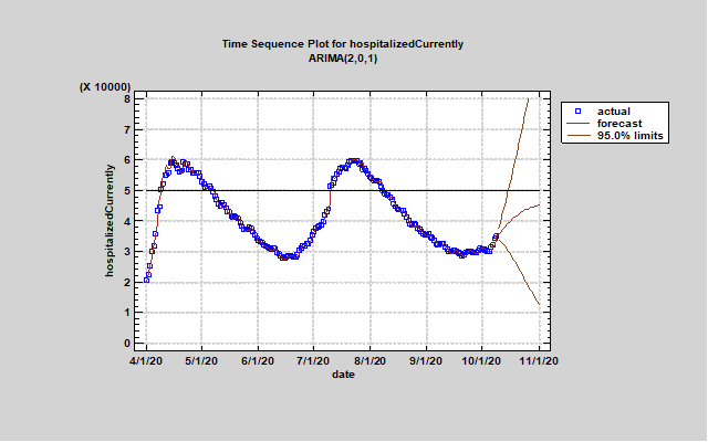
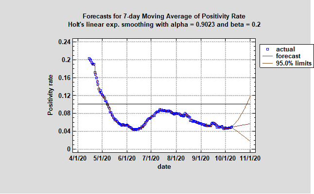
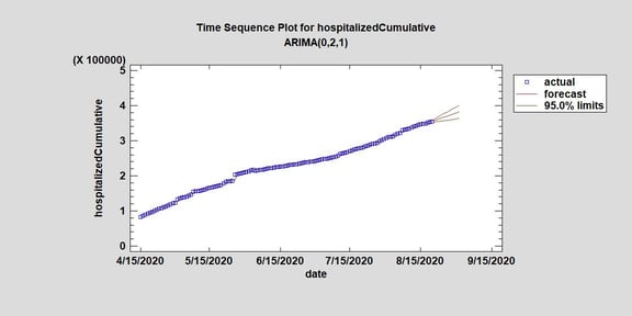
The Statgraphics Team examined the number of new people hospitalized every day from COVID-19 in the USA. As you should know, the total number of people in hospitals being treated for COVID-19 in the USA has been decreasing for weeks. We wanted to know if the number of new people admitted every day was also decreasing but discovered the number was not in decline. If you look at the time sequence plot for the cumulative number of people hospitalized, the forecast is upward trending. If we know that the same amount of people are being treated every day at hospitals for COVID-19 but the total number of people at the hospital are in decline, we can conjecture that people are not staying as long at the hospital. This could be because hospitals are treating younger people who do not need to stay or the treatments for COVID-19 are improving. Another positive sign is that the positivity rate forecast for the next two weeks suggests a possible decline close to 5% from 10% weeks ago. #\
August 19th, 2020
The Statgraphics Team has found positive signs regarding the pandemic in the United States. The number of positive tests per day has been declining over the last month and the number of currently hospitalized in the USA due to COVID-19 has been declining as well. The decline in the number of currently hospitalized began several days after positive tests first started to decline suggesting a positive correlation and lag exists between positive tests and the number of currently hospitalized. If that is the case and positive tests continue to decline, we should expect fewer people in the hospital due to COVID-19. Using Statgraphics 19’s Automatic Forecasting Procedure, we found possible downward trends and patterns in the forecast for both the number of daily positive tests and currently hospitalized from COVID-19.
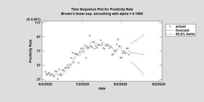
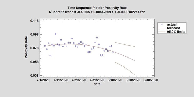
August 10th, 2020
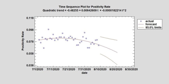
COVID-19 is still prevalent in many areas of the United States of America. Looking at the positivity rate in the USA, the Statgraphics Team has found a downward trend. Although the positivity rate itself is not forecast to decrease much perhaps only a percent in 13 days, it is great news to see many of our forecasting models projecting even a modest decline in the positivity rate. This suggests that the virus may be spreading at a lower rate now supported by the raw data of positive increases also decreasing over the last two weeks after peaking at nearly 75,000 positive tests on 7/24/2020.
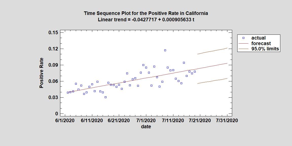
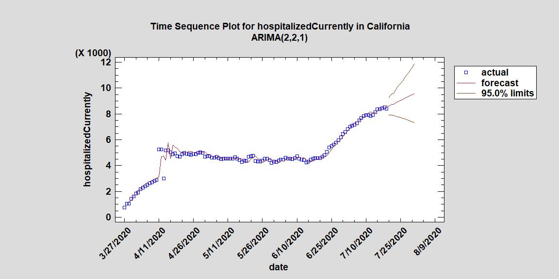
July 21st, 2020
There have been several new hotspots for the outbreak of COVID-19 in the United States. California, one of the wealthiest and most populated states, has been hit hard by the pandemic. One of the reasons the state’s coronavirus restrictions have been reinstated is because of the increase in the positivity rate of coronavirus tests. One can see from the chart below that a linear upwards trend was found with a positive increase of roughly .001 per day. This means that every ten days the positivity rate goes up one percent. If you look at the time sequence plot for current hospitalized in California, you see an upward trend meaning every day there are more people in the hospital for COVID-19 than the day before. There has been a large influx of younger Americans being treated for COVID-19 for overnight stays but because hospitals have finite rooms, resources and employees to manage sick patients, there is concern their healthcare system may be overwhelmed. California is waiting to see a decline in these numbers coupled with a decline in the positivity rate before reopening. One positive from that model is that the lower limit shows an unlikely but possible decline in the total number hospitalized based off the data.
July 9th, 2020
The Statgraphics Team has been creating forecasting models about the coronavirus in the USA for months. Last week, we wrote about the increase in the positivity rate and how it was positive correlated with deaths in America. Today, we are sad to note there was an increase in deaths for the last two days up from around 700 to 922 and 877 deaths per day. Although the cause of this increase is unknown, daily hospitalizations for COVID-19 are increasing as well. One of the forecasting models we created shows current hospitalizations may reach the peak they were at in April in two weeks. Some people believe this occurred because Americans are abandoning some social distancing practices while others hypothesize it is inevitable when the USA reopens the economy. Currently, a vaccination for COVID-19 is not set to be released until January 2021 and no treatment to prevent death has been discovered. Many Americans are planning not to take the vaccination this year and the vaccination may only be 70% to 75% effective (see source 1). The government continues to make tough calls on balancing preventing an economic downturn and spreading the virus. We hope to see the upward trends in the positivity rate, deaths and hospitalizations flatten and decline in the upcoming weeks as Americans continue to do their best to stop the pandemic.
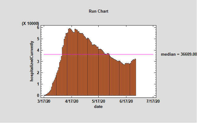
June 29th, 2020
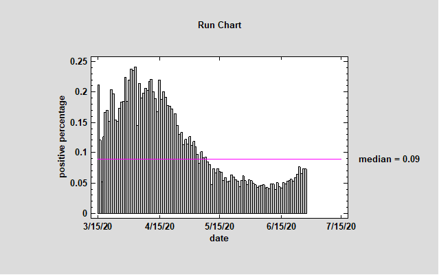
The United States has seen a record number of positive tests for coronavirus over the last week. Increased positive tests does not necessarily mean the virus is spreading but Florida, Texas, and California are now being called the new epicenters of the outbreak because of the spread there. In these states, government officials have reclosed some parts of the economy as the daily hospitalizations for COVID-19 in each state have increased from weeks ago. Interesting to note, some states that were considered epicenters in the beginning of this pandemic like New York and New Jersey have actually seen their daily hospitalizations and deaths decrease from a month ago. Whenever a government plans to reopen the economy during a pandemic, we would expect to see an uptick in positive tests, hospitalizations and deaths. The Statgraphics Team plotted the total number of daily hospitalizations since 3/17/20 with a median line for the same time period. Although the daily number of hospitalizations is in fact rising, it has not yet passed the median for this time period.
The second chart the Statgraphics Team created was the positive percentage of COVID-19 in the USA since 3/15/20. Looking at the chart, one can see that the positivity rate for COVID-19 tests in the USA is upward trending. Currently, the positivity rate is around 7 percent up from under 5 percent a few weeks ago. This also is expected when we re-open the economy but the rate has not yet passed the median line. The upward trend pattern is following our model’s predication from last week and alarmingly continues to rise. Knowing this, it is understandable why many state governments have reclosed parts of their economy fearing the virus would spread beyond the capacity of their healthcare system and resulted in more deaths. Some states have decided to keep their economies open but emphasized stricter regulations and rules in businesses like restaurants, bars, salons, and retail stores. If you do venture out during this pandemic, please be sure to keep a safe social distance and use proper hygiene behavior.
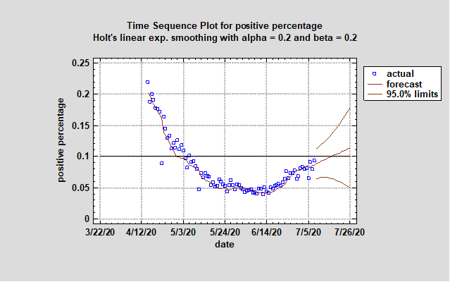
June 24th, 2020
In the United States of America, the number of positive tests for COVID-19 have been increasing. The Statgraphics Team believes a number of reasons are factors. First, there have been close to 100,000 more COVID-19 detecting tests given over the last two weeks than just one month ago. Per day, the United States is testing close to 500,000 people (data provided by https://covidtracking.com/api). An increase in the total number of tests given would account for some of the increase in positive tests. However, there could be numerous other reasons for the increase besides expanded testing such as the reopening of businesses, individuals relaxing social distancing practices, asymptomatic transmission, and the fact the disease may be more prevalent than previously thought. Because so little is still known about the novel virus, the Statgraphics team explored the ratio of positive tests to the total number of tests given every day to find a trend. Unfortunately if we look at the daily data since 5/11/2020, our forecasting model does find an upward forming trend (see Graph 1). This is not a positive sign for the country but many in the media and local governments believe the increase is partly because 20 to 40 year old people are no longer following the social distancing guidelines. In several states, the number of daily hospitalizations due to COVID-19 are increasing. However because the virus is so novel and testing was limited in the beginning of the pandemic, we do not have a baseline for the number of positive people in our country. Compared to other countries, our positive test result ratio is almost 3 times greater (see Source 1). The Statgraphics Team will continue to monitor this ratio and hopes it does not increase at this rate in the upcoming months. If you look at Table 1, you can see the 95 confidence limits and the upper limit reaches 10% in two weeks. This means that the virus may start to spread at a rate where the mortality rate increases. Please remember to wash your hands frequently and keep a safe distance from others to help slow the spread of this deadly virus.
Graph 1. Time Sequence for an Arima Model for the Positive Test Ratio for the Next Two Weeks
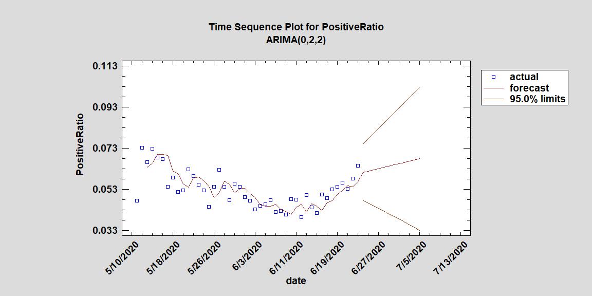
Table 1. Forecasting Table for the Ratio of Positive Tests to Total Tests Given Per Day
|
|
|
Lower 95% |
Upper 95% |
|
Period |
Forecast |
Limit |
Limit |
|
6/24/2020 |
0.0612422 |
0.0474174 |
0.075067 |
|
6/25/2020 |
0.0618513 |
0.0461417 |
0.077561 |
|
6/26/2020 |
0.0624605 |
0.0448852 |
0.0800358 |
|
6/27/2020 |
0.0630696 |
0.0436334 |
0.0825058 |
|
6/28/2020 |
0.0636787 |
0.0423768 |
0.0849806 |
|
6/29/2020 |
0.0642878 |
0.0411091 |
0.0874666 |
|
6/30/2020 |
0.064897 |
0.0398256 |
0.0899683 |
|
7/1/2020 |
0.0655061 |
0.0385233 |
0.0924888 |
|
7/2/2020 |
0.0661152 |
0.0371998 |
0.0950306 |
|
7/3/2020 |
0.0667243 |
0.0358534 |
0.0975953 |
|
7/4/2020 |
0.0673335 |
0.0344828 |
0.100184 |
|
7/5/2020 |
0.0679426 |
0.0330871 |
0.102798 |
June 9th, 2020
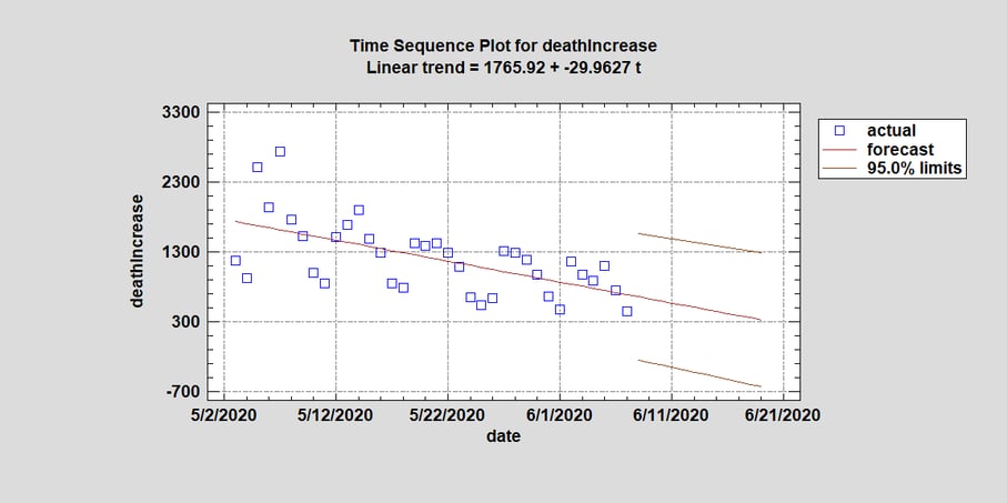
The Statgraphics Team reviewed the daily reported deaths in the USA due to COVID-19 according to the public data collected at the state and national level (https://covidtracking.com/api) and noticed there might be a downward trend forming. We originally looked at all the historic data for the USA but many of our forecasting models did not find a downward trend forming. This may be because a majority of the models were picking up a trend that fluctuated both up and down. So instead of looking at the data from the beginning of the outbreak, we looked at the last few weeks where there appeared to be a downward trend: data after May 3rd. One of the better forecasting models we reviewed was a simple linear trend. Originally, the linear trend had a negative slope for both the forecast and confidence limits. It forecast a rate of decrease in daily deaths by appropriately 30 people per day (see Time Sequence Plot 1). Using this model, we could forecast that in two weeks the daily death total of the entire country would only be around 330 people per day (see Table 1). However when we looked at the lower 95% confidence limit, we noticed that the daily death number turned negative.
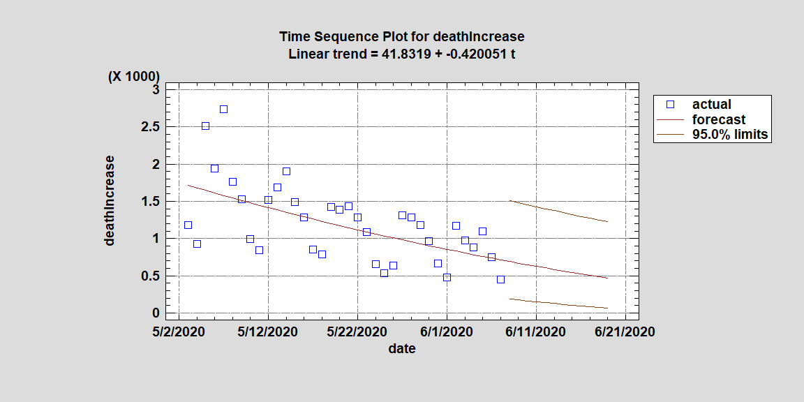
A proper forecasting model cannot project negative deaths and knowing that generally things tend to go more proportionally to zero than linearly, we decided to square root the data hoping it would create a model with a lower confidence limit that stayed positive. If you look at Time Sequence Plot 2, you will see that the lower 95% confidence limit does in fact stay positive and bends in the beginning then straightening out near zero. This shows a more realistic projection while still showing a downward trend. In both tables and plots, the upper confidence limit remains well over a 1000 people a day. However if the trend is not affected by mass gatherings, the reopening of the economy, and people who simply stop following proper health practices (such as washing your hands), we may see the daily death total for the entire country go below 500 in two weeks.
Finally, we went back to review several forecasting models using the historical data starting when the the first positive test was reported in the USA. If we look at a forecasting model using Brown's linear exp. smoothing for all the data transformed by their square roots, we find a similar downward trend forming and a forecast of the daily death total to also go below 500 in two weeks just like we did when we only looked at data since May 3rd.
Time Sequence Plot 1: A Forecasting Model for the Daily Number of Deaths in the USA from COVID-19 using the Raw Data
 Time Sequence Plot 2: A Forecasting Model for the Daily Number of Deaths in the USA from COVID-19 using the Square Root of each Daily Death Total to Create the Model
Time Sequence Plot 3: A Forecasting Model for the Daily Number of Deaths in the USA from COVID-19 from 1st positive reported test with data transformed by their square root
 Table 1: Forecasting the Linear Trend with Raw Data for the Next Two Weeks
|
|
|
Lower 95% |
Upper 95% |
|
Period |
Forecast |
Limit |
Limit |
|
6/8/2020 |
657.302 |
-247.98 |
1562.58 |
|
6/9/2020 |
627.339 |
-281.902 |
1536.58 |
|
6/10/2020 |
597.376 |
-316.013 |
1510.77 |
|
6/11/2020 |
567.414 |
-350.312 |
1485.14 |
|
6/12/2020 |
537.451 |
-384.795 |
1459.7 |
|
6/13/2020 |
507.488 |
-419.46 |
1434.44 |
|
6/14/2020 |
477.526 |
-454.305 |
1409.36 |
|
6/15/2020 |
447.563 |
-489.326 |
1384.45 |
|
6/16/2020 |
417.6 |
-524.52 |
1359.72 |
|
6/17/2020 |
387.637 |
-559.885 |
1335.16 |
|
6/18/2020 |
357.675 |
-595.418 |
1310.77 |
|
6/19/2020 |
327.712 |
-631.115 |
1286.54 |
Table 2: Forecasting the Linear Trend with the Square Root Data for the Next Two Weeks
|
|
|
Lower 95% |
Upper 95% |
|
Period |
Forecast |
Limit |
Limit |
|
6/8/2020 |
691.164 |
188.01 |
1510.75 |
|
6/9/2020 |
669.254 |
175.208 |
1482.5 |
|
6/10/2020 |
647.697 |
162.79 |
1454.73 |
|
6/11/2020 |
626.493 |
150.764 |
1427.41 |
|
6/12/2020 |
605.642 |
139.14 |
1400.54 |
|
6/13/2020 |
585.143 |
127.924 |
1374.12 |
|
6/14/2020 |
564.998 |
117.126 |
1348.13 |
|
6/15/2020 |
545.206 |
106.753 |
1322.57 |
|
6/16/2020 |
525.766 |
96.8139 |
1297.42 |
|
6/17/2020 |
506.679 |
87.3158 |
1272.69 |
|
6/18/2020 |
487.945 |
78.2668 |
1248.36 |
|
6/19/2020 |
469.564 |
69.6744 |
1224.42 |
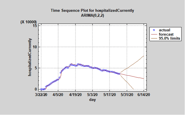
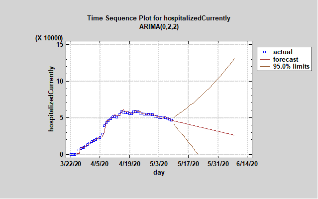
May 26th, 2020
The Statgraphics Team created a time sequence plot for the number of current hospitalized people in the USA due the coronavirus and the ARIMA (0,2,2) forecast continues its downward trend. Although the 95% upper bound is alarming, the forecast suggests the number of hospitalized in the USA has reached its peak. The loosening of some coronavirus restrictions may actually cause the number of people hospitalized to rise so please continue to practice safe social distancing and basic hygiene practices such as washing your hands and covering your mouth when you sneeze. We would like to thank our first responders, nurses, doctors, and hospital staffs for dealing with this health crisis so bravely.
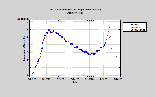
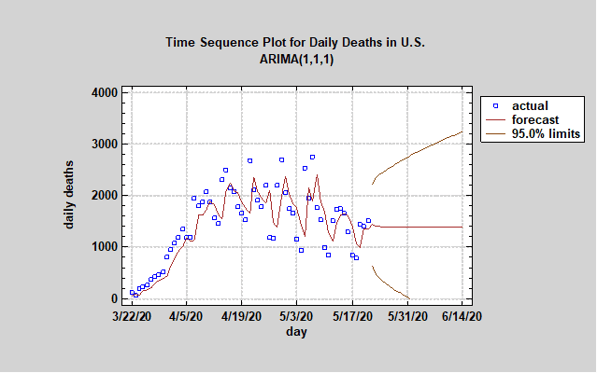
May 23rd, 2020
The Statgraphics Team has been plotting data obtained from the COVID Tracking Project of the Atlantic (covidtracking.com). This tracking project uses the best data available from each state. We created an ARIMA model (1,1,1) to forecast the future daily deaths in the US for the next two weeks. The 95% confidence interval remains wide but the forecast we chose shows the daily death total stabilizing around 1400 per day. There appears to be a downtrend using the eye test, but our forecasting model has not predicted one. It should be noted that the reported number of daily deaths has a strong seasonal component of 7 days.
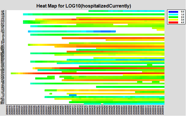
May 19th, 2020
In the graph below, the Statgraphics team charted the number of people hospitalized each day since March 3, 2020 due to the coronavirus illness. It is interesting to note that many states in the USA did not see their first official hospitalization until Mid-April. The heat map for the majority states has not returned to a blue or light blue color, which means that the current number of hospitalizations in each state has not lowered to under 1000 per state. The number has stabilized or lowered in several states but realize there are still many people fighting for their lives in hospitals across country.
May 10th, 2020
The latest data on number of people hospitalized in the U.S. due to COVID-19 shows an encouraging downward trend in our latest forecast. The total number of people hospitalized has fallen below 50,000 and appears to be headed to around 25,000 in the next 30 days. Please note, the difference between the upper and lower bounds of the confidence intervals remain wide. The upper bound even suggests potential exponential increase. But for first time the automatic forecasting procedure chose an ARIMA model with a significant downtrend. All of this may of course change depending upon how the virus responds to the reopening of the economy.
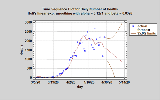
April 29th, 2020
The Statgraphics Team created a new forecasting model for the number of daily deaths in the US. The graph below of the model shows a very encouraging drop in the number of deaths each day in the U.S. due to the coronavirus. Statgraphics 18’s Automatic Forecasting procedure picked Holt’s linear exponential smoothing, which indicates a downward trend. The uncertainty is still large and yesterday’s daily death total was high, but the forecast function is headed in the right direction.
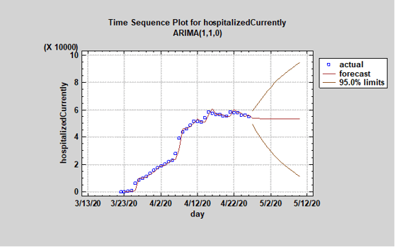
April 27th, 2020
Using last night’s data, we used Statgraphics 18’s Automatic Forecasting procedure to update our forecast for the number of people hospitalized in the US due to the COVID-19 outbreak. Over the last few weeks, we looked at a number of different forecasting models. This is the first ARIMA model we found that forecasts a decline in the number of total hospitalizations due to the coronavirus. It is great to see that the numbers are finally starting to consistently decline and we hope the drop continues over the next couple of days. However looking at the 95% confidence intervals, the model shows the number of hospitalizations can either rapidly increase or decline. Given the fact many states are reopening and loosening coronavirus restrictions, we could actually see an increase in hospitalizations over the next two weeks and not the decline predicted here. This is why the White House and state governments will continue to stress social distancing policies even as our country begins to reopen.
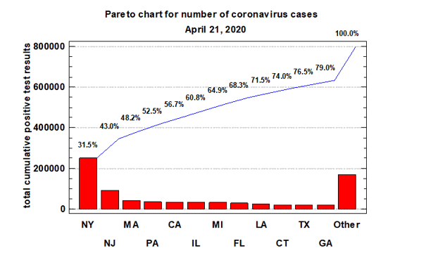
April 22nd, 2020
The Statgraphics team created a Pareto chart showing the 12 states in the US with the most coronavirus cases since the outbreak began. Looking at the chart, one can see that the 12 states have 79% of the cases. These states in descending order are New York, New Jersey, Massachusetts, Pennsylvania, Illinois, Michigan, Florida, Louisiana, Connecticut, Texas and Georgia. The other 38 states only have 21% of all coronavirus cases in America.
April 20th, 2020
The Statgraphics team used Statgraphics 18’s Automatic Forecasting procedure to forecast the total number of people hospitalized in the US due to COVID-19 for the next two weeks. Last week, we ran the same procedure and the forecast predicted a leveling in the number of total hospitalizations. Reviewing the daily data for the last three days, we saw the number of hospitalizations was decreasing for the first time in consecutive days since the outbreak began in the US. However given it was only declining at 1 percent per day, the ARIMA model’s forecast did not change much. In fact, it still only predicts a leveling in daily number of hospitalizations in the US and the 95% confidence interval remains wide even for a two week forecasting period. So although the decline in the number of daily hospitalized was positive news, we cannot yet forecast a downward trend.
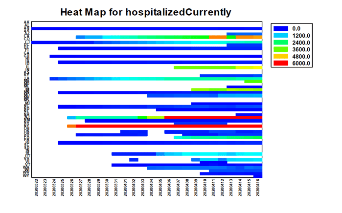
April 17th, 2020
The number of hospitalizations due to COVID-19 have been on the rise in the US since the virus reached America. Using data since March 23, we created a Heat Map for the total number of people currently hospitalized daily in each state. Statgraphics 18 can create time series heat maps such as the one created below. From our chart, it appears the number of total hospitalizations caused by the virus has steadily increased in the majority of states since the initial outbreak.
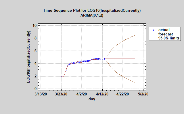
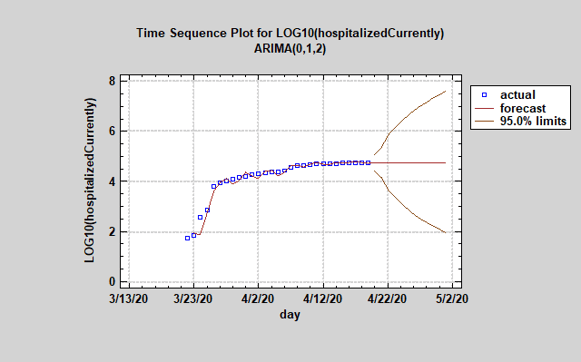
April 12th, 2020
Using Statgraphics 18’s Automatic Forecasting procedure, we forecast the total number of people hospitalized in the US due to COVID-19 for the next two weeks. The forecasting model chosen to predict future hospitalizations was an ARIMA (0,1,2) model. The forecast predicts a leveling in the number of total hospitalizations, but anyone can see the wide 95% confidence intervals for the next two weeks. Given this forecast and range of 95% limits, it will take several more days to verify that the curve is really flattening.
April 12th, 2020
This video shows the total number of confirmed cases of COVID-19 in each country for each day since 1/22/20. The following video was created using the dynamic geographic map visualizer (regions) Stalet in Statgraphics 18.
April 8th, 2020
The following video shows the daily changes in the number of deaths within each US state since beginning on March 8. The following video was created using images the dynamic geographic map visualizer (regions) Stalet in Statgraphics 18.
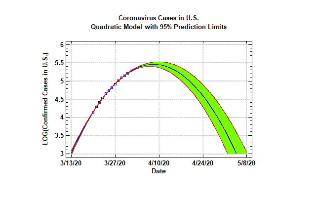
April 1th, 2020
Using the daily infected data provided by NPR, we created a forecasting model attempting to predict the future cases of infected people in the USA. In this model, we only use data from the last 13 days. Our newest model predicts that the peak in amount of infected cases may occur earlier in April than models that uses data from day one. It is important to note that the Automatic Forecasting procedure determined the quadratic model was the best fit from amongst a large number of candidate forecasting methods.

© 2025 Statgraphics Technologies, Inc.
The Plains, Virginia
CONTACT US
Have you purchased Statgraphics Centurion or Sigma Express and need to download your copy?
CLICK HERE