Published under: data visualization, data correlation, data forecasting, statistical analysis, statistics, Data analytics, Predictive analytics, Forcasting, analytics software, Statgraphics 18, data science
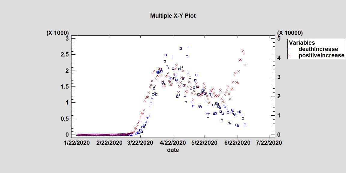
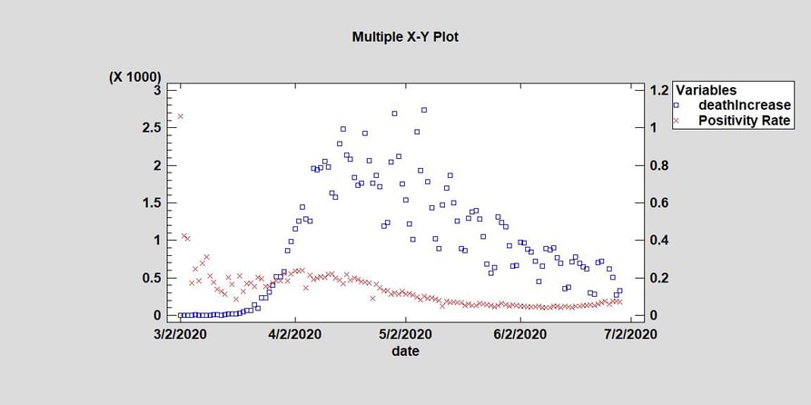
The Positivity Rate and amount of positive tests in the USA has been increasing (https://covidtracking.com/data). The Statgraphics Team wanted to determine if these increases are positively correlated with increases in deaths and if there is a lag between them. The first charts we look at were two time series plots comparing the positivity rate to daily deaths in the USA from COVID-19 and positive tests to daily deaths. If we look a Graph 1, there is a clear lag between the positive tests increases from COVID-19 and the deaths. The first substantial increase in positive tests started around 3/15/20 but the increase in deaths did not occur for another 7 days (around March 22). This makes sense because those infected with the virus typically take a few days to die. Look at Graph 2, the positivity rate begins to decline around 4/4/20 but the daily death total doesn’t begin to show any downward trend until eleven days later around 4/15/20. This again suggests there is a lag between positivity rates and daily death totals and may even be a positive correlation.
Graph 1. Time Series Comparing the Daily Death Total from COVID-19 in the US and the Positive Daily Increase

Graph 2. Time Series Comparing the Daily Death Total from COVID-19 in the US and the Positivity Rate
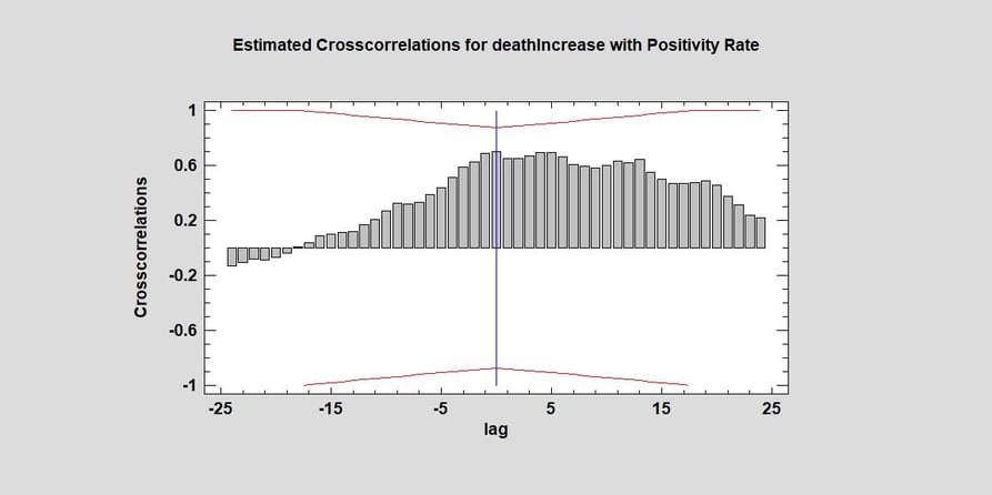
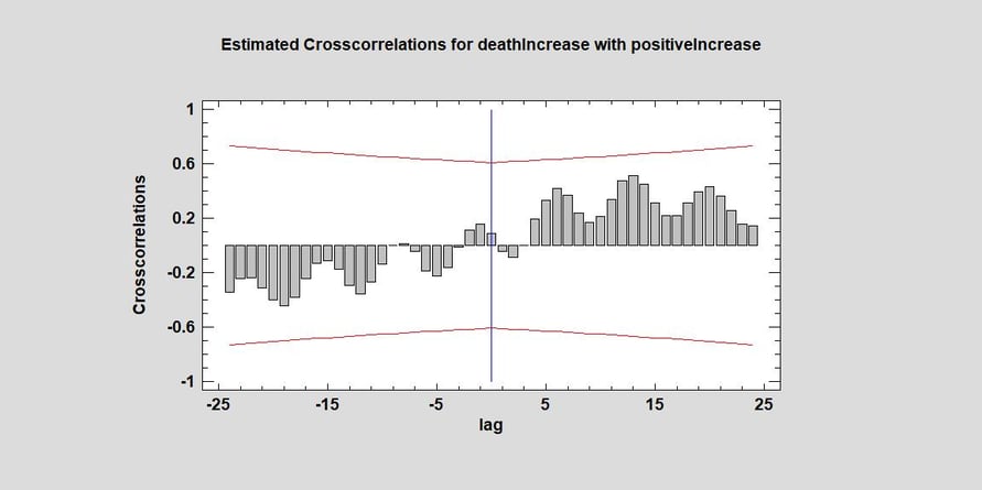
To determine if there was a positive correlation, we looked at the cross-correlation between daily deaths and positive tests/the positivity rate. We decided to use a partial data set starting around the decline in deaths of 4/14/20 to the present to not be influenced by the limited data we had in the beginning of the outbreak in the US. When looking at both cross-correlations, we can immediately see that the positivity rate is more closely correlated with daily deaths in America than positive increases. This would mean that increases in positive tests do not necessarily mean more deaths will occur. This virus has different mortality rates for different subsections of the population (in particular by age). If a large number of young people are testing positive, one would not expect a large increase in deaths. Neither chart passes the 95% confidence limits however there is positive correlation for both factors. The cross correlation between the positivity rate and deaths peaks first at plus 5 days and then again at plus 14 days. It begins to drop after two weeks but stays positive throughout our forecasting window suggesting that increases in the positivity rate is correlated with daily deaths in the USA. Look at Graph 4, we immediately see there is no positive correlation for the first 3 days but there is after the 5th day until the end of our graph. This suggests you would see an increase in the number of days 5 days after an increase in the number of positive tests. However, it is not statistically significant. The positive correlation does peak around positive 14 days suggesting the largest increase would occur two weeks after positive tests increases. In both graphs, the positive correlation continues after two weeks suggesting that people who have COVID-19 spread the virus to others and cause more deaths. It is interesting to note that there does appear to be weekly fluctuations due to reporting patterns or errors (such as under reporting on the weekends) as one can see peaks and valleys in the graphs.
Graph 3. Cross-correlations for Daily Deaths in the US from COVID-19 and the Positivity Rate
Graph 4. Cross-correlations for Daily Deaths in the US from COVID-19 and Daily Positive Tests
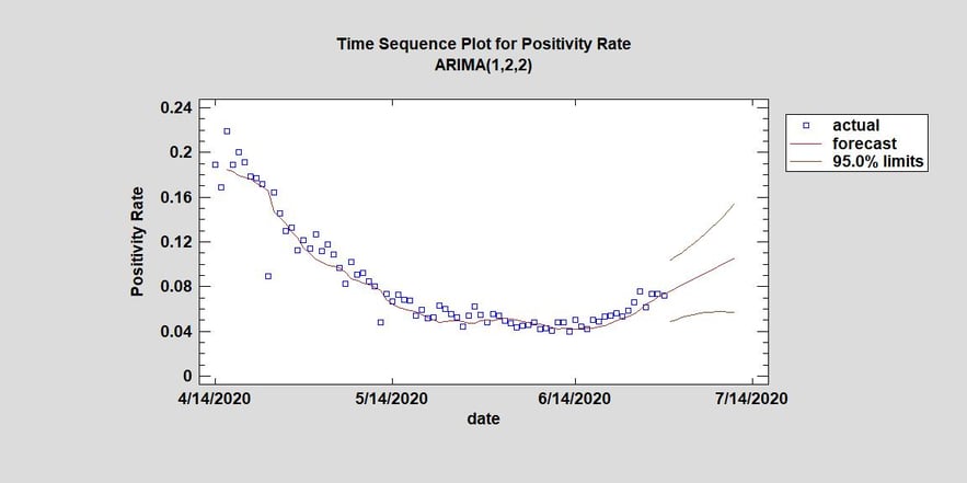
Knowing how the positivity rate and daily deaths are so positivity correlated, the Statgraphics Team believes the positivity rate is indeed an important benchmark to review. Using our Automatic Forecasting model, we created a forecast for the positivity rate for the next two weeks. It predicts that in less than two weeks, the positivity rate will approach 10% (see Graph 5). This is certainly alarming, but our model’s forecast is only using the previous data for positivity rates and no other factors for this forecast. Several states have already reclosed their economies because of this fear. The positivity rate could lower if stricter statewide policies and better hygiene practices are implemented by governments and carried out by individuals. To see if the positivity rate was correlated with our forecasting model we looked at the cross-correlation with residuals from our model and the positivity rate. We found in Graph 6 that there wasn’t any positive correlation until day 10 but there was statistically significant positive correlation between the two at day 13 at the 95% confidence level. This suggests that it may take two weeks to really see how a positivity rate increase affects death totals and is the reasoning behind several state governments to restricting or closing their economies. Many scientists and doctors believed this from the onset of this pandemic. Another fear is that the hospitals may be overwhelmed by the sheer number of new COVID-19 patients.
Graph 5. Time Sequence Plot for an ARIMA forecasting model for the Positivity Rate in the USA
Graph 6. Cross-correlations for Residuals of our Arima Model and the Positivity Rates at Daily Intervals

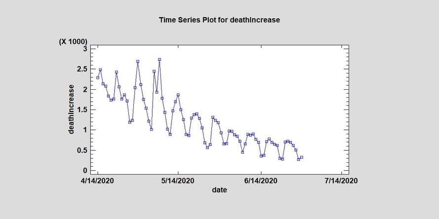
In conclusion, the Statgraphics Team hypothesizes there is a lag in the time that the daily number of positive tests or positivity rate affects deaths (from 5 days to 20 days). We have shown that they are positively correlated but neither is statistically significant. Currently, the number of daily deaths in the USA has been declining to under 700 per day (see Graph 7). If we look at Graph 1 again, we see that the increase in the number of daily positive tests began weeks ago and there has not been an increase in deaths in America from COVID-19 since then. The positivity rate has only just recently begun to increase and we found that it is more positively correlated with deaths than increases in the number of positive tests. Because we found a relatively high positive correlation between positivity rates and deaths, we would expect an increase in deaths in the next two weeks if the positivity increases as our model forecasts. However as mentioned previously if the positivity rate is increasing mainly because young healthy people are now getting the virus, we may not see much of an increase in daily deaths.
Graph 7. Time Series Plot for the Daily Number of Deaths in the USA from COVID-19 (removing outlier death total from 6/25/20)