

 By:
By: Published under: deviation dashboard, statistical analysis, data analysis, Data analytics, Statgraphics, analytics software, data science, dynamic data visualization, response surface plot, wind rose, population pyramid, choropleth maps, glyphs, Chernoff faces
In Reston, Virginia on May 16-19, 2018, the Interface Foundation of North America launched its inaugural Symposium on Data Science and Statistics bringing together data scientists, statisticians and machine learning experts to share knowledge and establish new collaborations. It was held in honor of Prof. Edward Wegman of George Mason University. During a session on Dynamic Data Visualization, I presented a talk in which I showed several examples of how adding animation to graphs can help make the underlying data come to life. The slides from that presentation are presented here.
Introduction
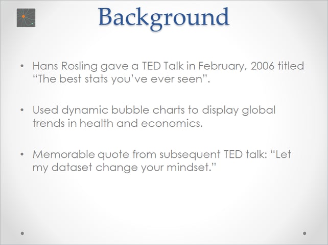
Background
2D Dynamic Visualizer
The example below is similar to that presented by Hans Rosling in his 2006 Ted Talk. It shows data downloaded from The World Bank. Each bubble represents a country. Four variables are displayed: life expectancy (Y-axis position), fertility rate or average number of children per woman (X-axis position), infant mortality rate (bubble color), and percentage of population living in rural areas (bubble size). Click on the graph to view a video in which the year displayed varies between 1961 and 2009. Notice the general tendency of the world to move up and left, with longer life expectancy and fewer children per woman. 3 countries have been labeled. Their paths through time are shown using a trail of "breadcrumbs". Note also that the reds and yellows disappear over time, indicating reduction in infant mortality throughout the world.
Dynamic Map by Region
After viewing Rosling's inspiring video, I wondered whether other simple graphs could also be enhanced by adding animation. The first graph I thought of was a choropleth map such as the one shown below. It shows crime rates by state starting in 1965. Click on the map to show a video illustrating how crime changed between 1961 and 2010.
Dynamic Map by Location
Other demographic maps display data by location rather than by region. For example, the map below shows the population of the largest cities in the United States in 1830. The size of each bubble shows the population of a city at a particular location. Start the video to see how cities have grown between 1790 and 2010.
Population Pyramid
A commonly used device to display the age distribution in a population is the population pyramid. The pyramid displays the number of people in various age categories, usually comparing 2 groups such as men and women. The pyramid shown below shows the distribution of age in the U.S. population in 1951. The post-WWII baby boom is quite evident, with a large number of children aged between 0 and 4 years. Play the video to see how the population has changed between 1950 and 2012. You'll see the "Baby-Boomers" getting older and a dramatic increase in the number of people (particularly women) living 80 years or more.
Deviation Dashboard
Quality engineers commonly use "3-sigma" control charts to monitor data over time. While that works nicely with a single variable, plotting multivariate data over time requires a different approach. One method for monitoring multivariate data is the Deviation Dashboard, which shows the status of multiple variables by plotting bars indicating how many standard deviations they are above or below their respective means. Bars within 1-sigma are colored dark green, those between 1-sigma and 2-sigma are colored light green, bars between 2-sigma and 3-sigma are colored yellow, and bars beyond 3-sigma are colored red. The video below shows data on fish counts at 13 locations in the Gulf of Maine between 1963 and 2013. You'll see a strong positive correlation between many of the locations and easily detect the extreme events.
Dynamic Wind Roses
Wind roses are used to display the distribution of wind speed and wind direction at a selected location. They are helpful when laying out runways or designing a field of wind turbines. The 360 degrees of the compass are divided into intervals. Petals are then drawn indicating the number of days when the wind was observed coming from each direction. Color is used to indicate the distribution of wind speed. In the wind rose below, watch how the dominant wind direction at midnight (from the south) changes around midday, with a simultaneous increase in velocity.
Multivariate Glyphs
When multivariate data is collected over time from different populations, it may be visualized using some sort of glyph. By definition, a glyph or pictograph is an image whose features are scaled to represent the value of multiple numeric variables. Examples include barcharts, piecharts, strip plots, and star plots. The video below uses a simple barchart to illustrate the rate of various types of crime in each state and the District of Columbia between 1961 and 2010.It's easy to spot those states with exceptionally low or exceptionally high crime rates. You'll also see dramatic changes throughout the years.
Chernoff Faces
In 1973, Herman Chernoff developed a glyph that illustrates multivariate data using features of the human face. The size and position of the head, eyes, ears, nose and mouth are scaled according to the value of separate variables. The plot below shows 3 features of the crime rate data: the width of the upper face represents the violent crime rate, the width of the lower face represents the rate of property crime, and the curvature of the mouth is proportional to the total crime rate. Faces that look similar correspond to states in which those 3 variables are similar. If you run the video, you'll see changes over the years as the crime rate rose and then fell again.
Process Optimization
Dynamic graphics are also useful for demonstrating fitted statistical models. Showing changes in a response as predictor variables are changed can help the analyst understand the relationships captured by the model. The 3-D contour plot shown below illustrates the results of a designed experiment, where strength has been modeled as a function of sealing temperature, cooling bar temperature, and amount of polyethylene. Starting near the point of maximum strength when polyethylene is 0, the square follows the path of steepest ascent until reaching the location in the space where strength is maximized.
Sensitivity Analysis
Animated graphs may also be used to help visualize how sensitive estimated models are to modeling assumptions. For example, the plot below shows the interpolated values of log potassium estimated by analyzing soil samples throughout a field. Using a method known as Kriging, a response map is created by connecting interpolated values at all points on a grid. The video shows the effect of increasing the distance between points at which the response is estimated.
Conclusion
When animation is added to many simple graphs, the data come to life and tell a story. If you want to try the procedures in this blog on your own data, look under Statlets on the Statgraphics 18 main menu. The analysis toolbar has a button that will record everything that happens in the Statlet window and save it in an AVI file that you can then embed in your web page or PowerPoint presentation.


