

 By:
By: Published under: statistical analysis, data analysis, design of experiments, response surface plot, trellis plots
Trellis plots are a very useful tool for displaying how the predicted response of a statistical model varies as a function of 3 or 4 factors. In Statgraphics 19.4, trellis plots have been added as an option to the response surface plots available when analyzing a designed experiment.
Trellis Plots with One Segmenting Factor
As an example, consider a factorial design run to determine the effect of 3 factors (temperature, concentration and type of catalyst) on the yield of a chemical process. The results of this experiment are shown below:
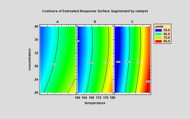
A trellis plot can show how the predicted yield varies with respect to temperature and concentration for each of the 3 types of catalyst. The trellis plot below shows 3 contour plots, one for each catalyst (A, B and C), on a common set of axes for temperature and concentration. It may be easily seen that temperature has a large positive effect on yield. There is also a strong temperature by catalyst interaction (the contour lines are much closer together for catalyst C).
Trellis Plots with Two Segmenting Factors
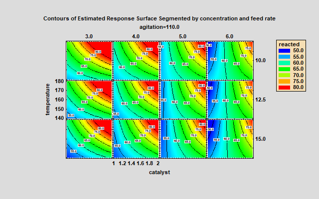
The above plot shows multiple contour plots using a single segmenting factor. When 2 segmenting factors are involved, the plots are arranged in rows and columns. The plot below shows the estimated percent reacted with respect to 2 primary factors (catalyst and temperature) at 12 different combinations of concentration and feed rate. Each column of the plot represents a different level of concentration, while each row represents a different level of feed rate.
Experiments with Mixture Components
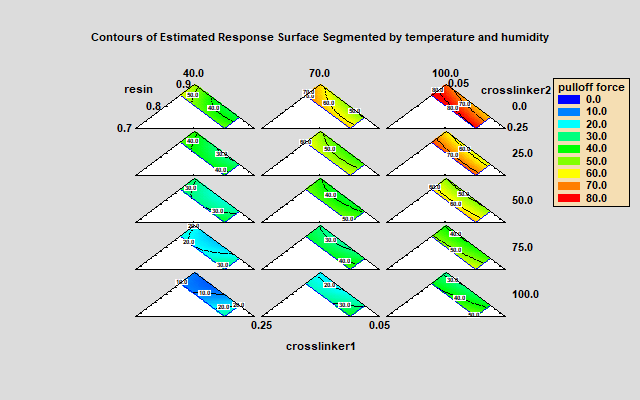
When the experimental design contains mixture components, the trellis plots are drawn using a simplex region defined by 3 mixture components. The trellis plot below shows the predicted pulloff force in an experiment involving 2 process factors (temperature and humidity) and 3 mixture components (resin, crosslinker1 and crosslinker2). In this experiment, each mixture component had both a minimum and a maximum level, so that the feasible region is less than the full simplex.
Multiple Response Optimization
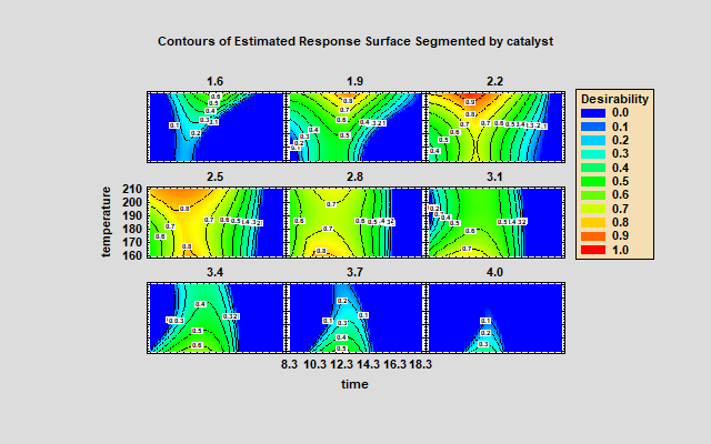
When optimizing more than one response, it is useful to display the estimated joint desirability of those responses. The plot below shows the estimated desirability in various locations of the experimental region for a design involving 3 experimental factors and 2 responses. The locations shown in red result in desirable values of both responses.
Displaying Design Properties
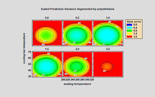
In addition to displaying estimated responses, trellis plots may also be used to illustrate important aspects of the experimental design that has been selected. For example, the plot below shows how the scaled predicted variance behaves when using a central composite design involving 3 factors. The standard error of the predictions is much smaller near the center of the design region and increases uniformly in all directions as you move away from the center.
Statgraphics 19.4
Trellis plots are available when using the Design of Experiments Wizard and legacy DOE procedures beginning in Statgraphics 19.4. If you'd like to try them, download a copy.


