

 By:
By: Published under: new feature, statistical analysis, big data analysis, data analysis, Data analytics, Statgraphics, analytics software, hexagon plots
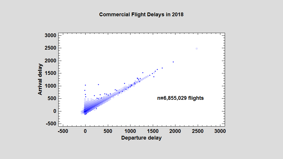
One of the most widely used graphical tools for displaying bivariate data is the X-Y scatterplot, which plots symbols at the location of every observation in a data set. For data sets numbering in the hundreds, such plots usually give the viewer a good idea of any relationship that exists between X and Y. However, for data sets numbering in the hundreds of thousands or even millions, such plots are not very helpful. As an example, consider the scatterplot below which shows data for 6,855,029 commercial flights made in the United States during 2008:
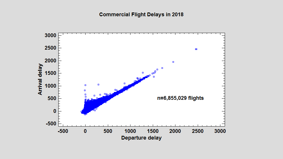
The horizontal axis displays the departure delay for each flight in minutes. The vertical axis displays the associated arrival delay. While general patterns may be seen, including a few outliers, the large amount of overplotting makes it difficult to interpret what's happening where the data is most dense. As we'll see, hexagon plots are one good solution to this problem.
Creating a Hexagon Plot
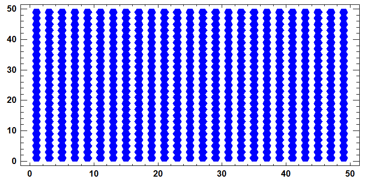
Daniel Carr from George Mason University developed a type of plot called a hexagon plot that helps address the overplotting problem. To create a hexagon plot, the plotted range of X and Y is divided into a two-dimensional honeycomb tessellation of hexagons, similar to that shown below:
The number of observations falling in the region covered by each hexagonal region is then counted. When the data are plotted, the color of each region represents the number of observations in that region, with isolated data points plotted separately. When applied to the aircraft flight delays, the result is shown below:
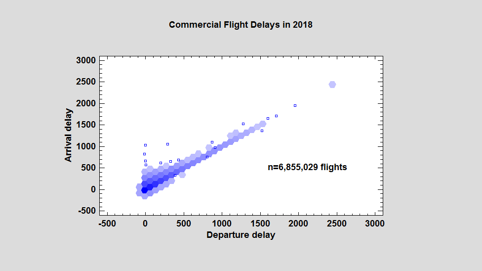
It's now much easier to see that the observations are most dense near the origin and along a diagonal line extending toward the upper right corner.
In Statgraphics 18, hexagon plots automatically replace X-Y scatterplots whenever the number of points to be plotted exceeds a specified threshold as determined by the user's Preferences:
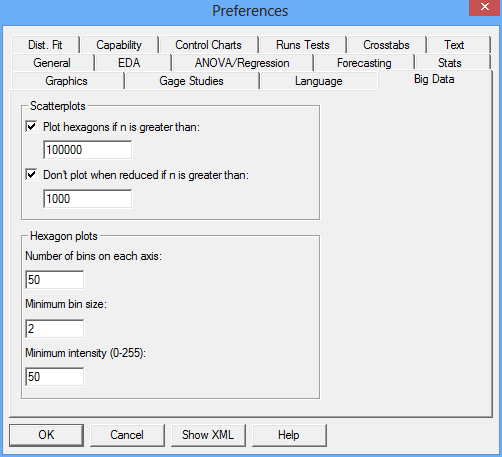
By default, the program switches to hexagon plots when n > 100,000. Users may also specify the number of hexagonal bins along the X axis (defaults to 50), the minimum bin size below which points are plotted separately, and the minimum color intensity of the bins on a scale of 0 to 255. Using a larger number of bins gives more detail:
Sunflower Plots
A variation of the hexagon plot that is particularly effective when the data set is not quite as large as the flight data shown above is the Sunflower Plot. This plot also divides the X-Y plotting region into a honeycomb tessellation of hexagons. Rather than shading the hexagons using a continuous grid of colors, a set number of colors are picked and used to display various ranges of counts. Rays are then drawn within the hexagons, with more rays representing larger counts.
As an example, data on systolic and diastolic blood pressure were collected from 4,434 patients participating in a long-term study of cardiovascular disease conducted in Framingham, MA. An X-Y scatterplot of the blood pressure readings is shown below:
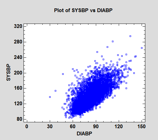
Again, it's very hard to make out any detail where the data are dense.
A sunflower plot for the same data is shown below:
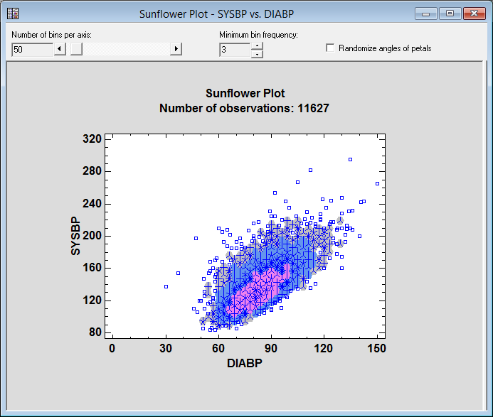
To create the plot, a honeycomb of hexagons similar to that of the hexagon plot is first created. The number of observations falling in each hexagonal region is then calculated. Each hexagonal region is then examined:
1. If the region contains less than m observations, a separate point symbol is drawn for each observation. By default, m = 3 but may be changed using the Minimum bin frequency control on the Statlet toolbar.
2. If the region contains between m and 10 observations, the hexagonal region is drawn using fill color #1 and one ray is drawn from the center of the hexagon to the boundary of the hexagon for each observation in that region. In the graph above, a gray hexagon with 4 rays indicates a region containing 4 observations.
3. If the region contains between 11 and 94 observations, the hexagonal region is drawn using fill color #2. In such a region, each ray represents 7 observations. (The number of observations in the region is rounded to the nearest multiple of 7.) In the graph above, a blue hexagon with 4 rays indicates a region containing approximately 28 observations.
4. If the region contains between 95 and 658 observations, the hexagonal region is drawn using fill color #3. In such a region, each ray represents 49 observations. (The number of observations in the region is rounded to the nearest multiple of 49.) In the graph above, a magenta hexagon with 4 rays indicates a region containing approximately 196 observations.
5. If the region contains 659 or more observations, the hexagonal region is drawn using fill color #4. Each ray then represents 343 observations. There are no such regions in the graph above.
The sunflower plot shows clearly that the points are densest in the region around X=80 and Y=120.
Conclusion
Hexagon and sunflower plots provide important tools for visualizing big data. They enable users to see where the points are most dense when normal scatterplots would show only a solid color. The graphs are also much faster to plot than scatterplots when the sample size is very large.
References
Carr, D.B., Littlefield, R.J., Nicholson, W.L., and Littlefield, J.S. (1987), “Scatterplot Matrix Techniques for Large N,” Journal of the American Statistical Association, 82, 424-436.
Carr, D.B. and Pickle, L.W. (2010) Visualizing Data Patterns with Micromaps, Chapman and Hall CRC Press.
Carr, D.B., Olsen, A.R. and White, D. (1993), :Hexagon Mosaic Maps for Display of Univariate and Bivariate Geographical Data," Cartography and Geographic Information Systems, 19, 228-236.
Cleveland, W.S. and McGill, R. (1984), “The Many Faces of a Scatterplot,” Journal of the American Statistical Association, 79, 807-822.
Dupont, W.D. and Plummer Jr., W.D. (2003), “Data Distribution Sunflower Plots”, Journal of Statistical Software, 8, 1-5.
Huang, C., McDonald, J.A, and Stuetzle, W. (1997), “Variable Resolution Bivariate Plots,” Journal of Computational and Graphical Statistics, 6, 383-396.


