

 By:
By: Published under: statistical analysis, data analysis, regression analysis, multinomial data, climate models, mosaic chart
As Hurricane Idalia approaches the western coast of Florida, there has been much discussion of whether hurricanes are getting stronger, perhaps due to climate change. This year, the high temperatures in the Gulf of Mexico appear to encourage rapid intensification as the storm moves north. I wondered, however, what historical data would say about the strength of hurricanes, since there have been many devastating storms in past years.
There is an interesting set of data on the National Hurricane Center's website showing the strength of every hurricane that struck the mainland U.S. since 1851. Although the site warns that hurricanes may have been undercounted prior to 1901, the data from 1901 and later are thought to be reliable. The first thing I did was do a crosstabulation of the data from which I generated the following mosaic chart:
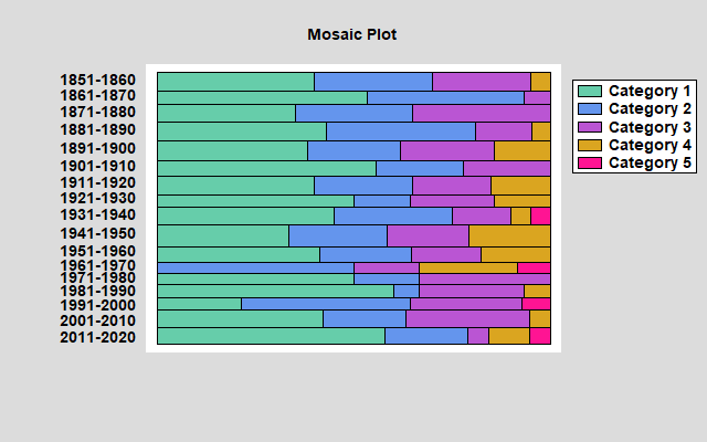
The vertical width of each bar is proportional to the number of hurricanes that hit the mainland in a particular decade. The horizontal dimension shows the frequency distribution within the indicated decade. No particularly dramatic trends there. The most interesting feature is the complete absence of Category 1 hurricanes in the decade 1961-1970, which has one of the thinnest bars since only 12 hurricanes hit the mainland that decade.
The next chart I made shows the number of major hurricanes (Category 3 or greater) and minor hurricanes (Category 2 or lower) by decade.
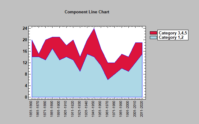
During 1941-1950, 24 hurricanes hit the mainland, 10 of which were category 3 or higher, which was an unusually large proportion of major hurricanes. Other than that, the fraction of major hurricanes each decade appears to be rather constant.
Naturally, I wanted to fit some sort of statistical model to the data. The model that came to mind was a multinomial regression model, which we recently added to Statgraphics. That model calculates the odds that a hurricane will be equal to category j for j=2,3,4,5 compared to being category 1. It then expresses the log odds as a function of one or more predictor variables. In this case, I chose decade to be my sole predictor, giving each decade a value between 1 and 17. The fitted regression model can then be used to show how the probability of a hurricane reaching each category has changed over time.
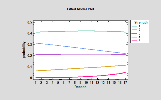
There is some suggestion that the probability of a storm being category 2 is decreasing, while the probability of a storm being either category 4 or category 5 is increasing. However, the only effect that is close to being statistically significant is that shown for category 5, which has a P-value of slightly less than 0.1.
It will be interesting to watch hurricanes this year. In 2021 and 2022, there were only 3 hurricanes that hit the U.S. mainland. However, 2 were category 4. Also, Hurricane Dora contributed to the devastating wild fires this year in Hawaii. As I write this, Hurricane Idalia has reached category 2 and is forecasted to get even stronger. There's still a lot of hurricane season left this year and I expect to collect considerably more data.


