

 By:
By: Published under: new feature, statistical analysis, data analysis, Data analytics, Statgraphics, analytics software, data mining, exploratory data analysis
In the world of data visualization, analysts are constantly looking for new methods of displaying data that add information to existing graphical devices. An important example of such a method is the so-called violin plot, which adds a nonparametric density estimator to the extremely popular box-and-whisker plot. Violin plots date back to an article published in The American Statistician by Jerry Hintze and Ray Nelson (1998), where they used them to plot the distribution of college faculty salaries. By adding an estimate of the probability density function, violin plots can show aspects of the data that would be missed in a simple box-and-whisker plot.
Sample Data
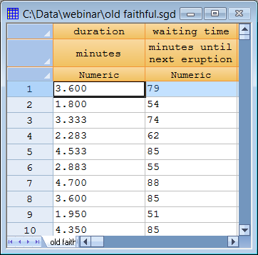
In this post, I'll look at a very interesting data set describing the duration of eruptions of the Old Faithful Geyser in Yellowstone National Park. The data, from Azzalini and Bowman (1990), consists of 2 variables: the duration in minutes of 272 consecutive eruptions, and the waiting time until the next eruption. The first several rows of data are shown below:
Many interesting questions may be asked of this data. In this blog, primary interest will center on the distribution of the duration of the eruptions.
Box-and-Whisker Plot
One of the most popular graphical methods for summarizing a sample of n observations taken from a population is the box-and-whisker plot developed by the famous statistician John Tukey. The box-and-whisker plot displays Tukey's 5-number summary of a data sample, consisting of the minimum value, the maximum value, the median, and the lower and upper quartiles. It shows at a glance the center of the sample of observations, its range, and the interval containing the center half of the data. With multiple samples, box-and-whisker plots placed side-by-side show the viewer whether or not there may be significant differences between the populations from which the data came. Over the years, interesting adaptions of the original box plot have been developed, including the use of point symbols to display outside points and notches to display confidence intervals for the median. (See Velleman and Hoaglin (1981) and Mcgill et al. (1990)).
The plot below is a typical notched boxplot. The box covers the central 50% of the data, ranging from the lower quartile to the upper quartile. The whiskers extend out to the minimum and maximum values. A plus sign is drawn at the location of the sample mean, while a vertical line is drawn at the sample median. The notch in the upper and lower edges of the box indicates the extent of a 95% confidence interval for the population median.
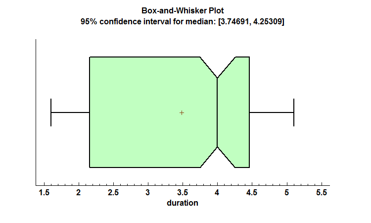
Approximately half of the eruptions last between 2.15 and 4.5 minutes, although the entire range is approximately 1.6 to 5.1 minutes. Some of the more interesting features of the data that may be seen in the plot include:
1. The sample median is considerably larger than the sample mean and is located fairly close to the upper quartile. This would normally be indicative of data that has strong negative skewness.
2. The interval covered by the lower whisker is much shorter than the distance from the lower quartile to the median. For data from most distributions, it's the other way around.
There is something interesting about the distribution of duration that we're just not seeing from this plot.
Nonparametric Density Estimator
The other graphical device commonly used to display the distribution of a sample is the frequency histogram. A frequency histogram divides the range of the data into a selected number of nonoverlapping intervals and plots bars indicating how many data values fall into each of those intervals. The plot below divides the eruption data into 25 intervals of equal width.
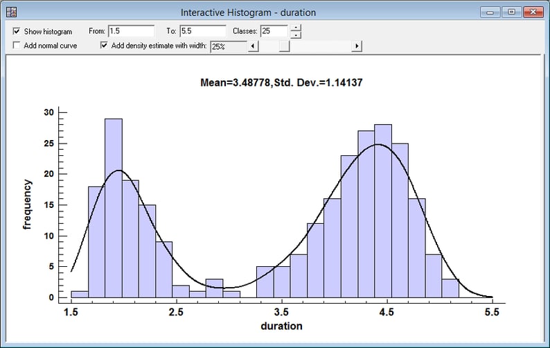
The frequency histogram shows clearly what is happening here: the distribution of duration is bimodal. There are two peaks: one at slightly less than 2 minutes and another around 4.5 minutes.
Superimposed on the histogram is a nonparametric estimate of the underlying probability density function. The probability density function at x illustrates how likely it is to see an eruption lasting about x minutes. The line itself is sometimes called a density trace, since it is estimated at various locations along the X axis. Given a set of n observations {x1, x2, ..., xn}, the estimated density function at x is given by
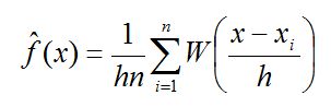
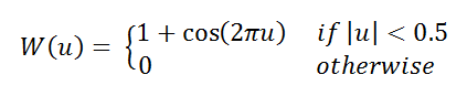
where h is a bandwidth expressed as a proportion of the range covered by the density estimate and W is a weighting function defined by
This is basically a weighted count of the observations in the neighborhood of x, where the weight decays with increasing distance from x. The larger the value of h, the smoother the estimate since it will give more weight to observations far removed from x. However, a value of h that is too large may hide important details about the distribution. In Statgraphics 18, the Interactive Frequency Histogram Statlet contains a control bar that lets the viewer dynamically change the value of h and see immediately how the density estimate changes. In the plot above, h has been set equal to 25% of the distance covered by the x-axis. The result clearly demonstrates that the distribution of duration is bimodal.
Violin Plot
The violin plot combines the best features of the box-and-whisker plot and the nonparametric density trace into a single graphic device. As shown below, the density trace is superimposed above and below the box plot.
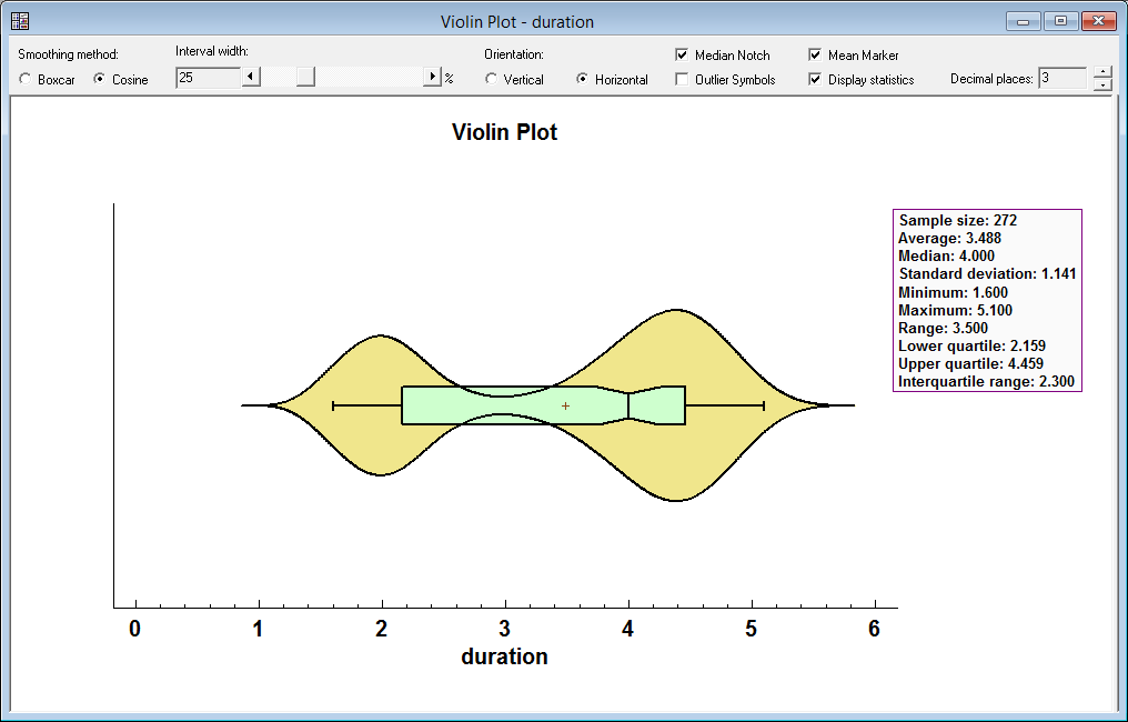
Again, in Statgraphics 18 a slider bar lets the viewer interactively change the bandwidth. Such a plot is much more informative than a box-and-whisker plot displayed by itself.
Multiple Violin Plot
As with a box-and-whisker plot, the violin plot is also very useful when comparing multiple data samples. For example, the plot below shows the distribution of traffic counts by month on the Golden Gate Bridge in San Francisco over a period of years.
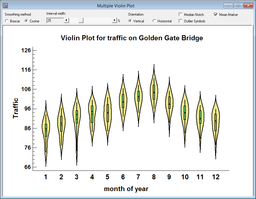
Traffic increases steadily throughout the beginning of the year, peaks in August, and then starts to decline. Unlike the Old Faithful eruption data, the distribution of traffic counts within each month appears to be unimodal.
References
Azzalini, A. and Bowman, A. W. (1990). "A look at some data on the Old Faithful geyser". Applied Statistics 39, 357-365.
Hintze, Jerry L.; Nelson, Ray D. (1998). "Violin Plots: A Box Plot-Density Trace Synergism". The American Statistician. 52 (2): 181–184.
Mcgill, Robert, Tukey, John W. and Larsen, Wayne (1978). "Variations of Box Plots". The American Statistician. 32 (1): 12-16.
Tukey, John W. (1977) Exploratory Data Analysis. Addison-Wesley.
Velleman, P.F. and Hoaglin, D.C. (1981). Applications, Basics and Computing of Exploratory Data Analysis. Boston: Duxsbury.


