

 By:
By: Published under: statistical analysis, data analysis, Data maps
There has been much interest recently in the effects of climate change on surface temperature around the globe. The Climate Research Center at the University of Maine did a wonderful graph of average daily temperatures on the planet https://climatereanalyzer.org/clim/t2_daily/ During several days in early July, planet Earth set an all-time record for the hottest day ever recorded. I also noted an article by the BBC stating that June, 2023 was the hottest June on record in the U.K. (https://www.bbc.com/news/science-environment-66104822). But here in Northern Virginia, we had one of the nicest springs in many years, with a lot of sunshine but low humidity. So I decided to see how temperatures varied from one place to another last month.
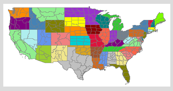
It's not always easy to find the data you want in the format you need. After some searching, I discovered an interesting web site maintained by the U.S. National Centers for Environmental Information, a part of NOAA. It turns out that the contiguous United States has been divided into 344 climate divisions based on geographical features. Virginia has 6 divisions: Tidewater, Eastern Piedmont, Western Piedmont, Northern, Central Mountain, and Southwestern Mountain. You can download data on temperature and precipitation by division for selected months.
The first thing I needed to do was find a shape file with boundaries for the 344 climate divisions. I found it here, on a web page hosted by NOAA's Physical Sciences Laboratory. Two files were needed, an SHP file with the boundary coordinates and a DBF file which links each of the 344 divisions to the proper boundaries. From the DBF file, I created the required Statgraphics SGD file as we describe in our mapping documentation. I then managed to create a plot of the 344 divisions.
By the way, I'll be happy to send you the files I created.
It was then time to display June temperatures. So I downloaded the average daily temperature for June, 2023 in the 344 climate divisions. Here's the plot I created:
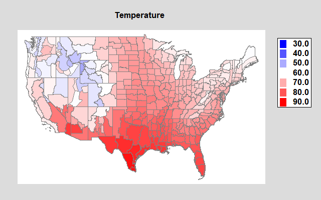
The heat in the south is easy to see. The mountain states such as Colorado, Idaho and Wyoming had much cooler weather. Northern Virginia looks pretty comfortable at about 67.8 degrees F.
Unfortunately, the graph above doesn't reflect well the possible effects of climate change. A more interesting variable to look at is what NCEI calls the "Anomaly". The anomaly is the average temperature in June 2023 minus the average temperature in the same division during the 20th century. This anomaly is shown below:
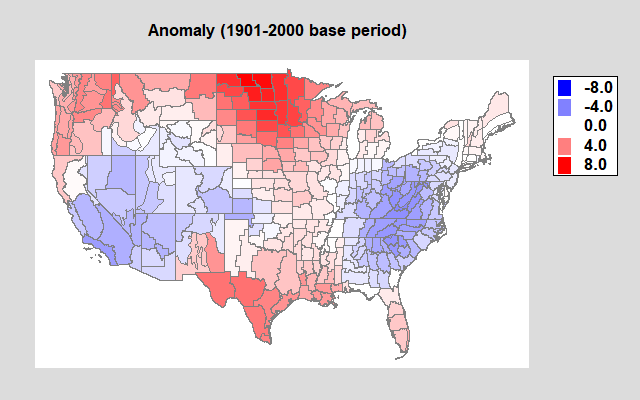
It was almost 8ºF hotter in the north central states and in Texas, while about 5ºF cooler in the Southwest and the Mid-Atlantic states. Northern Virginia is blue, which confirms my expectations that it was cooler than usual (by 2.2ºF).
It's now July and getting hotter every day. I'll create another plot at the end of the month that we can compare to June.


