Published under: statlets, multiple time series, control charts, deviation dashboard
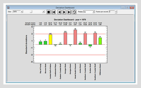
 The new Deviation Dashboard Statlet is designed to display the status of multiple time series by showing how much each series deviates from its respective mean. There are two types of displays:
1. A barchart format in which the height of each bar indicates how much each time series deviates from its mean as a multiple of its standard deviation. Bars are color-coded based on their height with respect to the 3-sigma limits.
2. A linechart illustrating how the deviations have changed over time.
The controls on the Statlet toolbar may be used to dynamically change the time period.
See the Deviation Dashboard in action.
Learn more about the extraordinary features in Statgraphics Centurion XVII.

 By:
By: 


