Published under: ARIMA models, Data analytics, Predictive analytics, Forcasting, Statgraphics 18
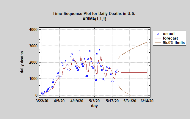
The Statgraphics Team has been plotting data obtained from the COVID Tracking Project of the Atlantic (covidtracking.com). This tracking project uses the best data available from each state. We created an ARIMA model (1,1,1) to forecast the future daily deaths in the US for the next two weeks. The 95% confidence interval remains wide but the forecast we chose shows the daily death total stabilizing around 1400 per day. There appears to be a downtrend using the eye test, but our forecasting model has not predicted one. It should be noted that the reported number of daily deaths has a strong seasonal component of 7 days.
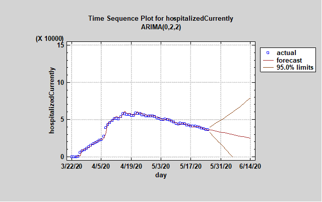
 We also created a time sequence plot for the number of current hospitalized people in the USA due the coronavirus and the ARIMA (0,2,2) forecast continues its downward trend. Although the 95% upper bound is alarming, the forecast suggests the number of hospitalized in the USA has reached its peak. The loosening of some coronavirus restrictions may actually cause the number of people hospitalized to rise so please continue to practice safe social distancing and basic hygiene practices such as washing your hands and covering your mouth when you sneeze. We would like to thank our first responders, nurses, doctors, and hospital staffs for dealing with this health crisis so bravely.
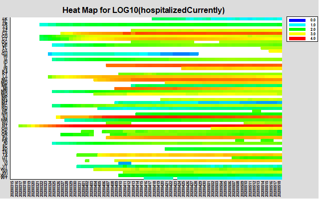
 In the graph below, the Statgraphics team charted the number of people hospitalized each day since March 3, 2020 due to the coronavirus illness. It is interesting to note that many states in the USA did not see their first official hospitalization until Mid-April. The heat map for the majority states has not returned to a blue or light blue color, which means that the current number of hospitalizations in many states have not lowered to under 1000 per state. However, the number has stabilized or lowered in several states but don't forget there are still many people fighting for their lives in hospitals across country.