

 By:
By: Published under: data visualization, statistical analysis, frequency tables, data analysis, Golf Analytics, Data analytics, Statgraphics, ANOVA, regression analysis, twoway tables
When I'm not sitting at my computer, I love to play golf. I'm not good but I always dream of getting better. In the last 4 years, I've played 195 rounds at Blue Ridge Shadows Golf Club in Front Royal, Virginia. It's a very scenic (and hilly) golf course with water hazards on seven holes and many bunkers. After every round, I type my hole-by-hole scores into a Statgraphics datasheet and analyze them in various ways.
Hole-by-Hole Scoring
One of the most interesting plots I've created shows how many times I've scored a birdie, par, bogey, or other (double-bogey or worse) on each hole. A mosaic plot does a great job of displaying that data:
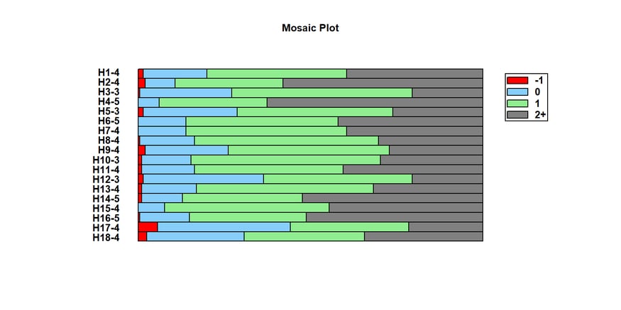
The data that's being tabulated is my score on each hole minus par for that hole. So for the par 4 hole #1, I'm showing you my score on that hole minus 4. The red bar shows how often I've birdied that hole, the blue bar how often I've parred it, the green bar how often I've gotten a bogey, and the grey bar how often I've gotten a double bogey or worse. There's lots to see in this graph, including:
1. My average score tends to be in the low 90's, since I double-bogey holes a little more frequently than I score par or better.
2. I tend to double bogey the par 3's least often and the par 5's most often, although I do double-bogey hole #2 a lot as well since it's a long par 4 going uphill all the way.
3. My best chance of getting a birdie is on hole #17, which is a short dogleg right par 4 which fits the left to right pattern of many of my drives.
Do the Hole Handicaps Match My Game?
Another question that interested me is how well the handicaps on the various holes matched my performance. So I did a regression analysis of my score on each hole with respect to par against the stated handicap for that hole. Here's what I got:
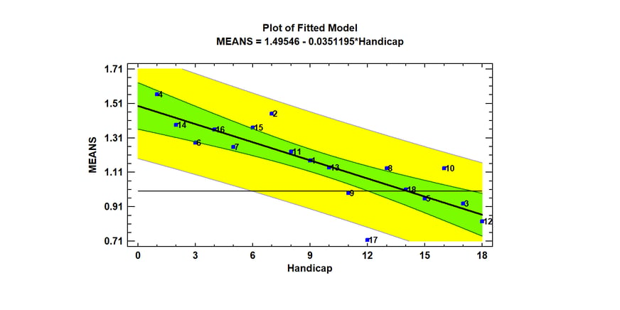
By and large, my performance correlates strongly with the handicaps. I average better than bogey on 5 holes (3, 5 , 9, 12 and 17) with #17 being my best hole. Farthest from the regression line is that nasty uphill #2 and also #10, which is a par 3 across a ravine to an elevated green. I am impressed, however, about how strong the correlation is on that graph (r=-0.83).
Am I Getting Better?
Now to the important question: Am I getting better over time? To examine that question, I created an X chart of my gross scores versus date:
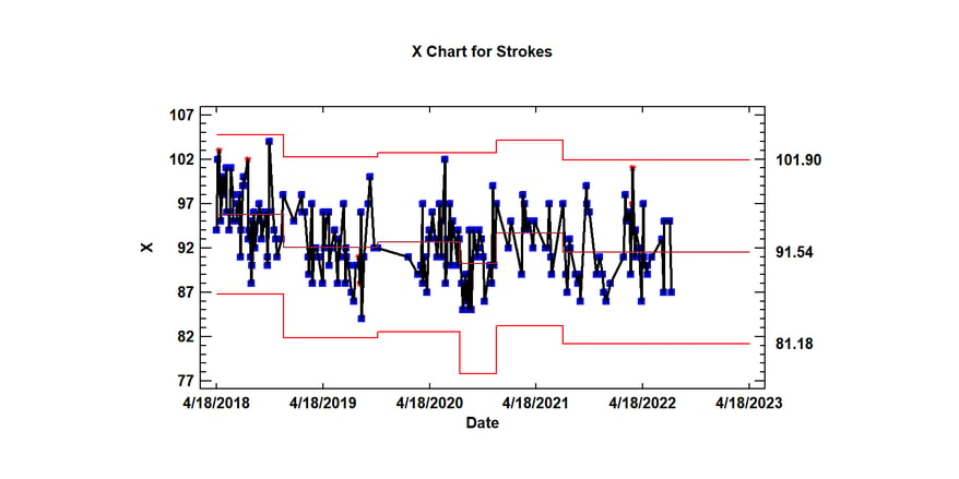
Compared with the spring of 2018, it does seem like I've shaved a few strokes off of my game. But the variation is still large. There also seems to be some positive skewness in my recent scores (it's easier to have a very bad day than a very good one).
Time of Year Effects
I then looked at the effect that time of year might have on my scores. Since I play less often in the winter months, you'd think I might play worse then. So I did an analysis of variance on my scores versus month and created this means plot:
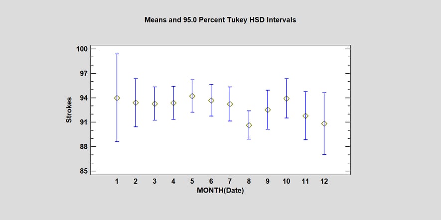
For each month, the plot shows my average score plus and minus the width of a Tukey HSD interval. These intervals have the property that if any 2 intervals do not overlap, there is a statistically significant difference between the means of those months. Alas, although the mean score in August is the lowest of any month, its interval overlaps all of the others, indicating that there is no statistically significant difference in how I score on average between any 2 months.
Modeling Effects
Finally, I decided to try and build a model that would relate my score in a particular round to factors such as how many times I was in a sand trap, how many penalty strokes I suffered, how often my drive was in the fairway, etc. I started by creating a scatterplot matrix to show the relationship between various pairs of variables. The plot below shows that matrix, with LOWESS smooths for each pair of variables:
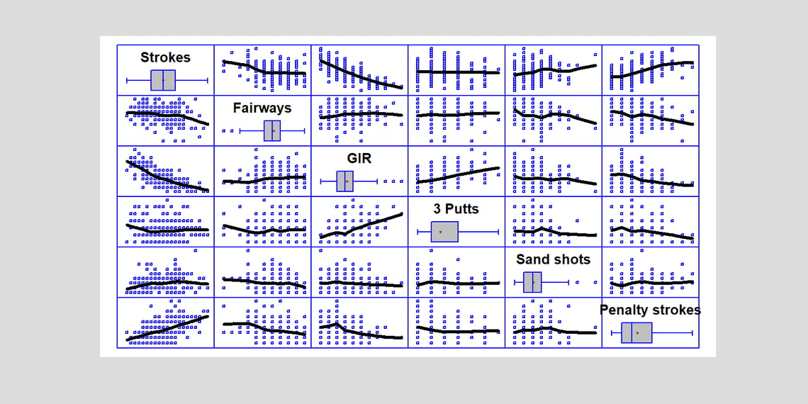 The plots in the top row show the relationship between total Strokes and various predictive factors. There appears to be some relationship between Strokes and Fairways, GIR and Penalty strokes.
I then built a multiple regression model. The estimated coefficients are shown in the following table:
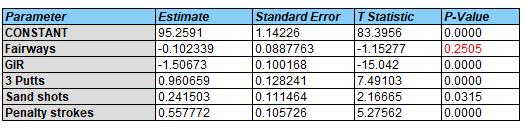
The most significant factor is how many greens I hit in regulation (GIR). Each time I get to a green in regulation, I seem to reduce my overall score by about 1.5 strokes. On the other hand, each 3 putt costs me about a stroke. Sand shots cost about 1/4 of a stroke. Penalty strokes cost about 1/2 of a stroke in the final score. Surprising, given the effect of all these factors, is that it doesn't seem to matter how many fairways I hit.
1.5 strokes per green in regulation may seem surprising. It's either one of two things: GIR may be a good overall measure of how well I'm playing that day, or it could be that my short game needs to be improved.
Another thing that surprised me was looking at the one-variable at a time correlation plot:
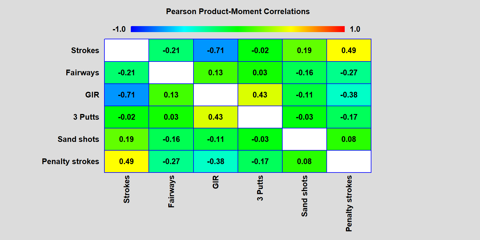 The correlation of each factor with total strokes is shown in the top row. The number of 3-putts is not highly correlated with strokes. But it is correlated with the number of greens I reach in regulation. I speculate this is because, when I do hit a green in regulation, I tend to have a longer putt than when I don't.
If we plot the partial correlations instead, we'll see in the top row the correlation of each factor with total strokes having accounted for the effect of all the other factors:
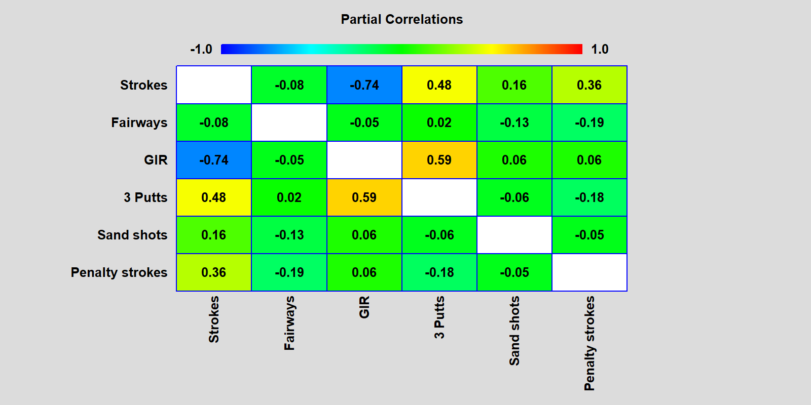
The number of 3 Putts has a strong correlation with Strokes once the effect of GIR has been accounted for. What is it they say? "Drive for show, putt for dough." Looks like both are important. Just glad I don't have to make a living doing either.
If you'd like more information on how I created these plots, send me an e-mail. Right now, I'm going to the range to get my game ready for next month (August).


