

Published under: multiple time series, statistical analysis, chi-square test, data analysis, Data analytics, Statgraphics, analytics software, Statgraphics 18, dynamic data visualization
‘U.S. consumers demand variety, quality, and convenience in the foods they consume. As Americans have become wealthier and more ethnically diverse, the American food basket reflects a growing share of tropical products, spices, and imported gourmet products. Seasonal and climatic factors drive U.S. imports of popular types of fruits and vegetables and tropical products, such as cocoa and coffee. In addition, a growing share of U.S. imports can be attributed to intra-industry trade, whereby agricultural-processing industries based in the United States carry out certain processing steps offshore and import products at different levels of processing from their subsidiaries in foreign markets.’ – USDA1
This statement from the United States Department of Agriculture is clear. The demand for imported foods and beverages has been steadily increasing. With data provided from the U.S. Department of Commerce, U.S. Census Bureau, we will look at the amount of money spent on food and beverage imports in the U.S. from 1999 to 2017. The data set used here contains ‘the import values of edible products (food and beverages) entering U.S. ports’ determined to be imports by their origin of shipment. Food imports are not a small part of our economy or diet. Americans and American corporations spent 136 billion dollars in 2017 on food and beverages from other countries. From 1999 to 2017, the amount the U.S. spent on food imports has risen over 300% ($43.1 Billion in 1999 to $136.2 Billion in 2017). The only yearly decline occurred during the 2008 recession.
To dive deeper into the data, we have created a Food Inflation Index using 2017 prices as a marker for inflation. The inflation rates used to create our index were provided by the U.S. Labor Department’s Bureau of Labor Statistics’ CPI report.2 The data once adjusted for inflation created the graph below and still shows the steady increase. This is logical given import spending rose by 300% while food inflation averages between .3% and 5.4% yearly during the same period. To factor in U.S. population growth, we created a per capita data set using the U.S. Census Bureau’s annual report each July 1st.3 The U.S. Population growth rate ranged only .7% to 1.1% yearly during this time period, which again would not be the main cause of the increase.
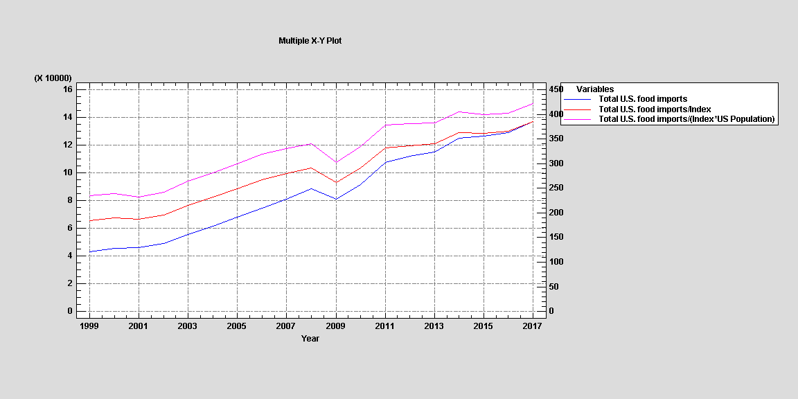
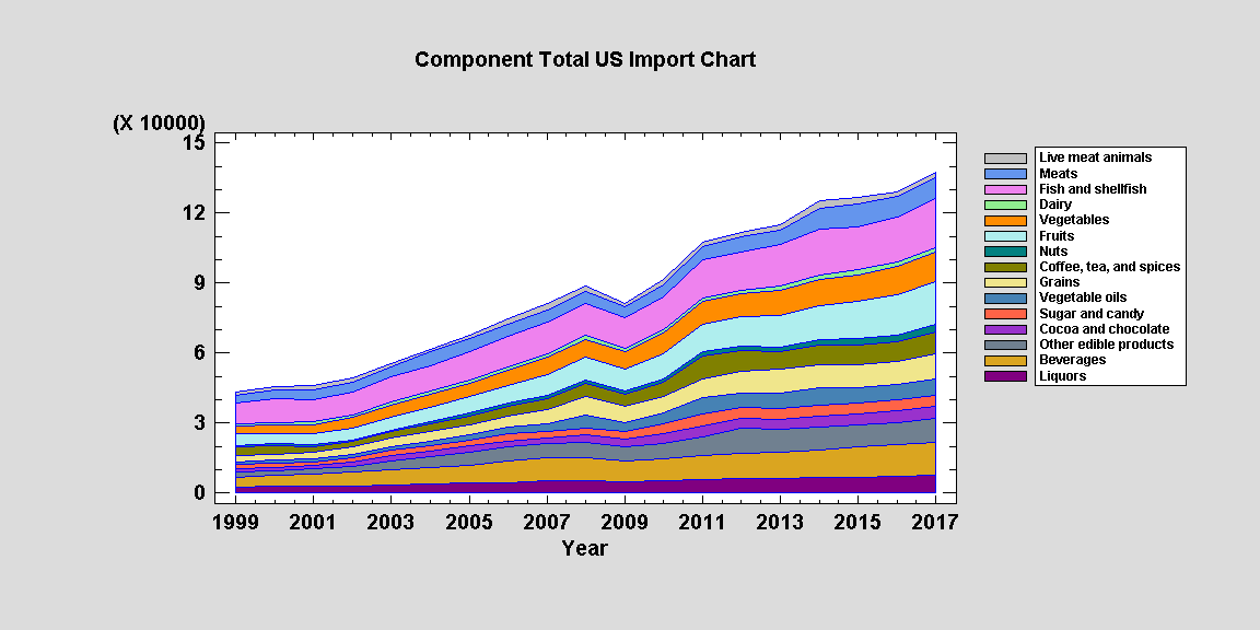
Even in terms of 2017 food prices and adjusted for the increase in population, the rise in import spending has been steady since 2001 besides the aforementioned decline during 2008. This graph is interesting because it shows a swift recovery from 2009 to 2011, but then import spending flattens out when accounting for inflation during 2011 to 2013. To see what type of food and beverages the U.S. spent more money on, we created a component line graph during this period with the categories provided by the USDA’s report. The results are below.
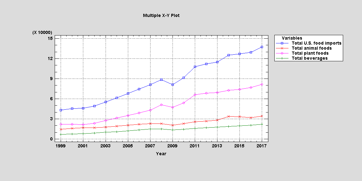
To begin our breakdown of food and beverage groups, it is beneficial to look at a broader set of categories: Food, Plant, and Beverages. The results adjusted to our Food Inflation Index per capita are below.
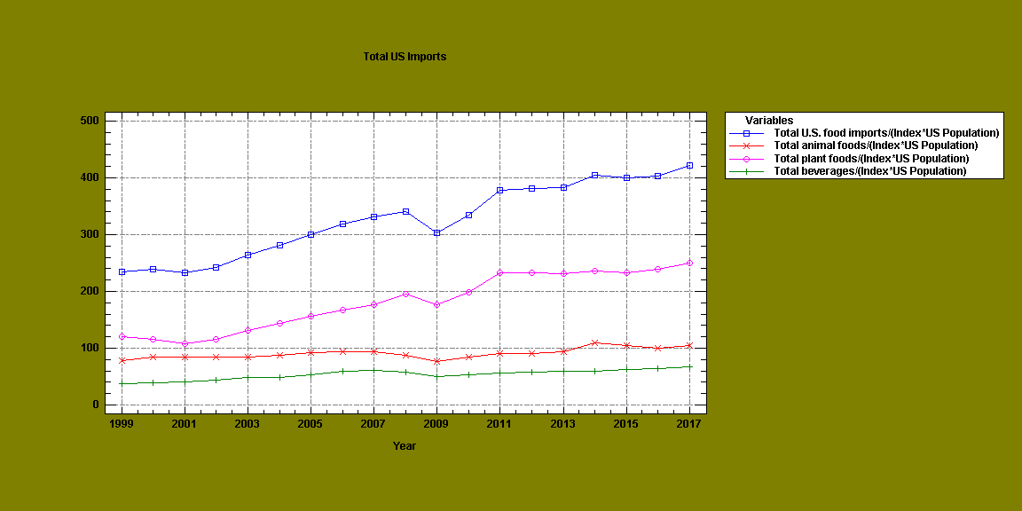
Although all 3 groups have been increasing, it clear that the amount of plant foods being imported is the greatest cause for the overall increase. To look at each import category more closely, we created a multiple X-Y Plot with each group adjusted for food inflation per capita below.
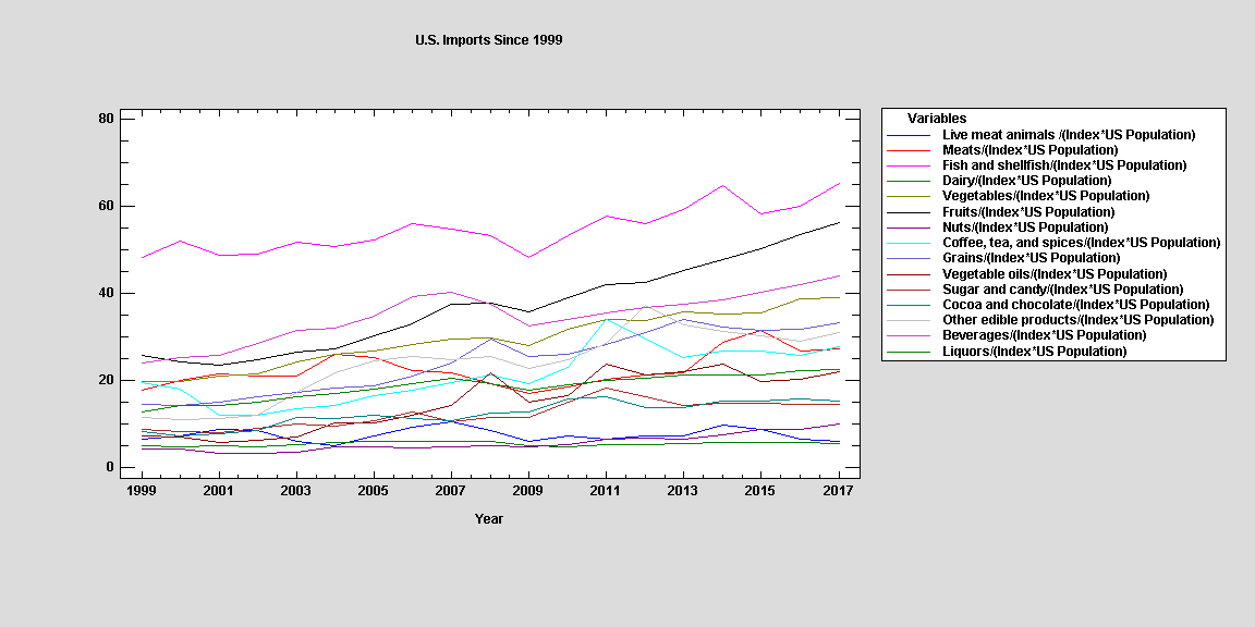
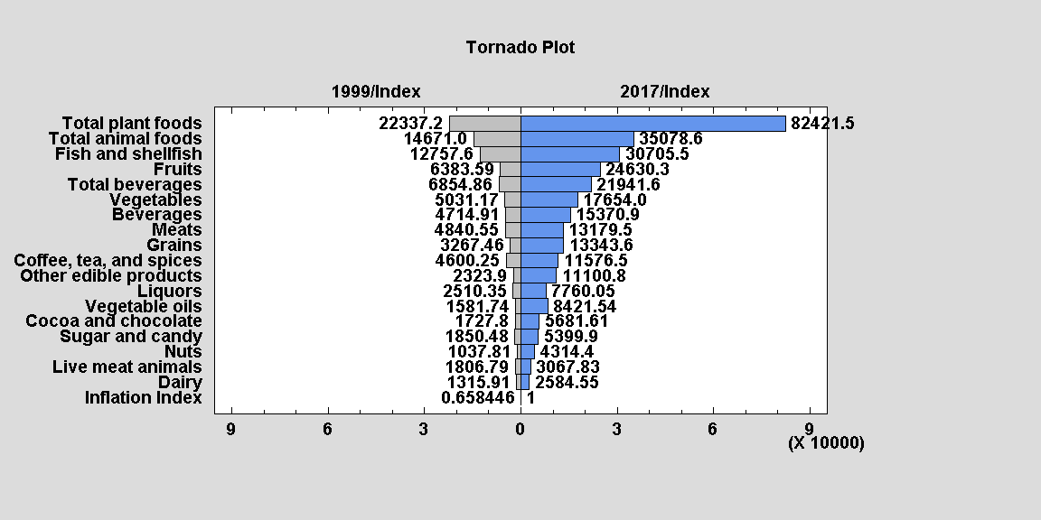
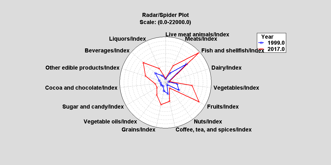
You can see Fruits, Vegetables and Grains are the biggest gainers as well as Fish and Shellfish. Perhaps, Americans’ diet has been steadily changing or American corporations have imported more of these groups for creation of their products. Regardless, there clearly is an overall upward trend and demand for imported food products since 1999. Below we created a Tornado Plot with money spent in 1999 compared to 2017 adjusted by our inflation index. One can easily see that every category has increased since 1999 but some have at much lower rates than others, such as Live meat and animals and Dairy.
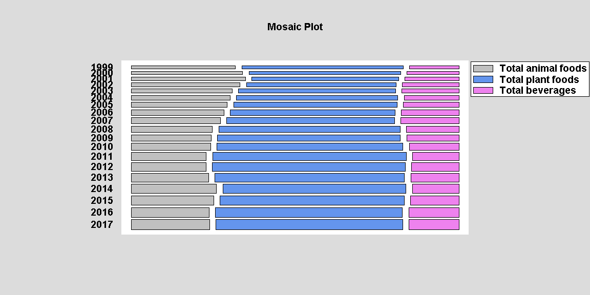
A Mosaic Plot is an interesting way to examine the relationship between categorical variables. In particular, it is a proportional comparison. Thru the Chi-Square Test of Independence, one determines whether or not to reject the idea that the row and column classifications are independent. In our case since the P-Value is less than .05, we can reject the hypothesis that rows and columns are independent at the 95.0% confidence level. Therefore, we can determine there is dependence between these groups. In the graph below, one sees the proportional spending for plant foods increase since 1999.
Conclusion:
The reasons provided for the increase in import spending by the USDA are logical. Americans are wealthier with the ability to have more discretionary and luxury spending which they may use on exotic or gourmet imported foods. Americans are also more diverse than ever, and some would desire foods not common or native to the US and introduce such tastes to the general public. Americans also demand certain foods and beverages year round which are not possible to mass produce domestically given our climate and geography. Through our graphs and charts, we showed how the increase in total plant foods imported was the greatest reason for the increase in overall spending. In particular, fruits, vegetables, fish/shellfish and grains were the biggest gainers. It would be interesting to determine if Americans consider these groups a luxury or are simply changing their diets. However, the USDA stated American businesses are importing more food component products instead of growing or purchasing every item domestically. The increase in grain spending would support that reasoning, but it is not possible to determine the weight of these factors from this data. Given the recent trend, we do not expect import spending to decline without some outside factor like an increase on import taxes or other protection/infrastructure for American producers. We also cannot determine if our demand surpassed our own agricultural and production limitations. The U.S. continues to grow in wealth, population and diversity. The data found here show import spending has changed with it.
More Charts:
All images used in this post were created using Statgraphics 18.
Sources:


