
Version 19.3 of Statgraphics introduces a new tool for data visualization called Trellis Plots. Trellis Plots are segmented plots that display data or fitted models for each combination of one or more conditioning variables. For example, histograms of the distribution of height among individuals might be displayed side-by-side for men and women. The plots are designed to help users visualize how data change across levels of the conditioning variables.
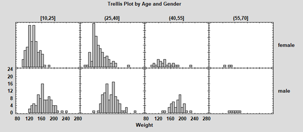
To display characteristics of a single quantitative variable, the Numeric Y trellis plot may be used. It creates box-and-whisker plots, frequency histograms, and normal probability plots. For example, the plot below contains histograms showing the distribution of weight for 514 attendees at selected fitness centers in California. The sample is segmented according to the age and gender of the attendees. Controls at the top of the window let the analyst change the cells in the histograms.
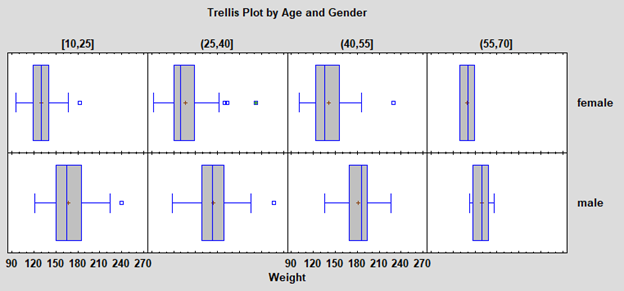
An alternative view using box-and-whisker plots is also available:
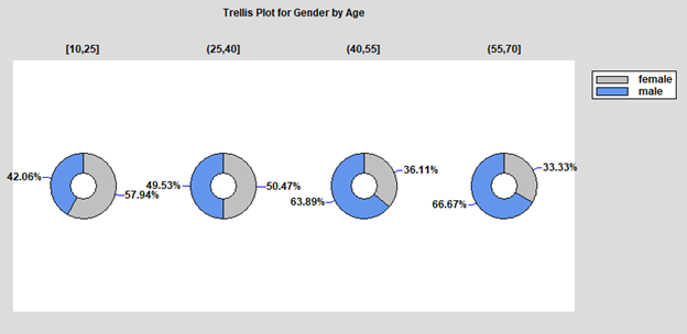
To display characteristics of a single categorical variable, the Categorical Y trellis plot may be used. It creates barcharts, piecharts and donut plots. The plot below shows the percentage of males and females attending the fitness centers in the samples illustrated above, segmented by age.
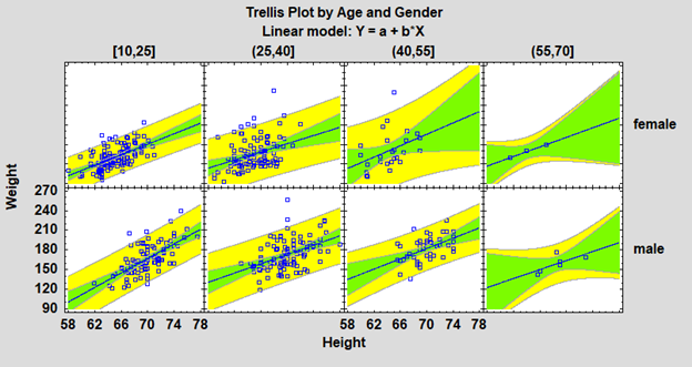
To display how the relationship between 2 quantitative variables changes with the values of 1 or 2 conditioning variables, the Y versus X trellis plot may be used. The plot below shows the relationship between height and weight for individuals in the fitness center example. Linear regression lines have been fit to each segment. Nonlinear regression models and nonparametric smoothers may be plotted instead.
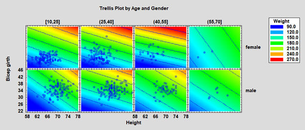
To display how the relationship between 3 quantitative variables changes with the values of 1 or 2 conditioning variables, the Z versus X and Y trellis plot may be used. The plot below shows the relationship between height, bicep size and weight for individuals in the fitness center example. A regression model has been fit to the data in each section of the plot. Bubble charts or a LOWESS smooth may be plotted instead.


© 2025 Statgraphics Technologies, Inc.
The Plains, Virginia
CONTACT US
Have you purchased Statgraphics Centurion or Sigma Express and need to download your copy?
CLICK HERE


