
Graphical methods are often the best way to extract the information available in data. There are many techniques available to visualize that information, depending on the nature of the data. Statgraphics contains a large set of visualization tools, many with built-in animation to show how data change over time.

| Procedure | Statgraphics Centurion 18/19 | Statgraphics Sigma express |
Statgraphics stratus |
Statgraphics Web Services |
StatBeans |
|---|---|---|---|---|---|
| Matrix Plot |  |
|
|
|
|
| Parallel Coordinates Plot | |
||||
| Andrews Plot | |
||||
| Star Glyphs and Sunray Plots | |
||||
| Chernoff Faces | |
||||
| Population Pyramid Statlet | |
||||
| Wind Rose Statlet | |
||||
| Violin Plot | |
||||
| Diamond Plot | |
||||
| Heat Map | |
||||
| Sunflower Plot | |
||||
| Demographic Map Visualizer (Locations) | |
||||
| Demograpic Map Visualizer (Regions) | |
||||
| Bivariate Density Statlet | |
||||
| Trivariate Density Statlet | |
||||
| 1D Dynamic Visualizer | |
||||
| 2D Dynamic Visualizer | |
||||
| 3D Dynamic Visualizer | |
||||
| Ordered Waterfall Plots (V19 only) | |
||||
| Sequential Waterfall Plots (V19 only) | |
||||
| Three Dimensional Waterfall Plots (V19 only) | |
|
|||
| Trellis Plots (Numeric Y) | |
|
|||
| Trellis Plots (Categorical Y) | |
|
|||
| Trellis Plots (Y vs X) | |
|
|||
| Trellis Plots (Z vs X and Y) | |
|
Our data visualization software can produce matrix plots that are used to display all pairs of X-Y plots for a set of quantitative variables. With multivariate software, these are a good method for detecting pairs of variables that are strongly correlated. It is also possible to detect cases that appear to be outliers.
The matrix plot at the right has two additions:
1. A box-and-whisker plot for each variable in the diagonal locations.
2. A robust LOWESS smooth for each plot, which highlights the estimated relationships between the variables.

More:Matrix Plot.pdf
The Parallel Coordinates Plot is a multivariate visualization technique that can be very useful in identifying differences and similarities amongst observed cases when the number of dimensions is too large to use a standard scatterplot using data visualization software. Statgraphics multivariate software uses the line for the i-th row to connect the standardized values of each variable in that row, where the standardized value equals the observed value minus the sample mean of that variable divided by the sample range.

More: Parallel Coordinates Plot.pdf
The Andrews Plot is similar to the Parallel Coordinates Plot, except that it encodes the information for each variable on a sine or cosine with different frequencies.

More: Andrews Plot.pdf
A glyph is a geometric object made with data visualization software that represents the values of each quantitative variable. The size of the polygon in each direction is scaled according to the value of a specific variable. Cases with similar characteristics will have similar shapes.

More:Star Glyphs and Sunray Plots.pdf
Chernoff Faces provide a method for visualizing multivariate data by drawing cartoon faces in which various features are scaled according to the values of different quantitative variables. They were developed by Herman Chernoff and first described in the article titled “The Use of Faces to Represent Points in k-Dimensional Space Graphically”, published in 1973. While their effectiveness as a method for identifying groups of cases has been debated, they represent a novel alternative to more conventional multivariate visualization techniques and can be made with Statgraphics multivariate software and our data visualization tools.

More: Chernoff Faces.pdf
The Population Pyramid Statlet is designed to compare the distribution of population counts (or similar values) between 2 groups. It may be used to display that distribution at a single point in time, or it may show changes over time in a dynamic manner. In the latter case, various options are offered for smoothing the data and for dealing with missing values.

More: Population Pyramid.pdf or Watch Video
The Wind Rose Statlet displays data on a circular plot, depicting the frequency distribution of variables such as wind speed and direction. It may be used to display the distribution at a single point in time, or it may show changes over time in a dynamic manner.

More: Wind_Rose_Statlet.pdf or Watch Video
The Violin Plot Statlet displays data for a single quantitative sample using a combination of a box-and-whisker plot and a nonparametric density estimator. It is very useful for visualizing the shape of the probability density function for the population from which the data came.

More: Violin Plot Statlet.pdf, Multiple Violin Plot Statlet.pdf or Watch Video
The Diamond Plot procedure creates a plot for a single quantitative variable showing the n sample observations together with a confidence interval for the population mean.

More: Diamond Plot.pdf, Multiple Diamond Plot.pdf or Watch Video
The Heat Map procedure shows the distribution of a quantitative variable over all combinations of 2 categorical factors. If one of the 2 factors represents time, then the evolution of the variable can be easily viewed using the map. A gradient color scale is used to represent values of the quantitative variable.

More: Heat Map.pdf or Watch Video
The Sunflower Plot Statlet is used to display an X-Y scatterplot when the number of observations is large. To avoid the problem of overplotting point symbols with large amounts of data, glyphs in the shape of sunflowers are used to display the number of observations in small regions of the X-Y space.

More: Sunflower Plot.pdf or Watch Video
The Demographic Map Visualizer (Locations) Statlet is designed to illustrate changes in location statistics over time. Given data at each of k locations during p time periods, the program generates a dynamic display that illustrates how the data have changed at each location. The data at each location is drawn using a bubble whose size is proportional to the observed data value. As time changes, the analyst can follow changes in the data at each location.

More: Demographic Map Visualizer (Locations).pdf or Watch Video
The Demographic Map Visualizer (Regions) Statlet is designed to illustrate changes in regional statistics over time. Given data for each of k regions during p time periods, the program generates a dynamic display that illustrates how the data have changed in each region. Each region is drawn using a color that illustrates the level of the selected variable. As time changes, the analyst can follow changes in the data within each region.

More: Demographic Map Visualizer (Regions).pdf
The Bivariate Density Statlet creates a frequency histogram for 2 columns of numeric data. It is used to visualize the joint distribution of 2 random variables. The controls on the toolbar make it easy to change the definition of the classes into which the data are grouped. The density function of a bivariate normal distribution with the same means, standard deviations, and covariance as the data may be created instead of a histogram. In addition, a nonparametric density estimator may be drawn.

More: Bivariate Density Statlet.pdf or Watch Video
The Trivariate Density Statlet displays the estimated density function for 3 columns of numeric data. It does so using either a 3-dimensional contour plot or a 3-dimensional mesh plot. The joint distribution of the 3 variables may either be assumed to be multivariate normal or be estimated using a nonparametric approach.

More: Trivariate Density Statlet.pdf or Watch Video
The One-Dimensional Visualizer Statlet is designed to plot multiple time series in a manner that helps users visualize the changes in multiple variables over time. Given n time series observed over p time periods, the program generates a dynamic display that illustrates how each of the variables has changed over time. The basic plot shows bubbles plotted on an X-Y display. The position along the Y axis represents the value of the primary data variable. The size and color of the bubbles may be used to illustrate other variables. As time increases, the analyst can follow changes in all of the variables.

More: One-Dimensional Visualizer.pdf or Watch Video
The Two-Dimensional Visualizer Statlet is designed to plot multiple time series in a manner that helps users visualize the changes in multiple variables over time. Given n time series observed over p time periods, the program generates a dynamic display that illustrates how each of the variables has changed over time. The basic plot shows bubbles plotted on an X-Y display. The positions along the X and Y axes represent the values of two primary data variables. The size and color of the bubbles may be used to illustrate other variables. As time increases, the analyst can follow changes in all of the variables.

More: Two-Dimensional Visualizer.pdf or Watch Video
The Three-Dimensional Visualizer Statlet is designed to plot multiple time series in a manner that helps users visualize the changes in multiple variables over time. Given n time series observed over p time periods, the program generates a dynamic display that illustrates how each of the variables has changed over time. The basic plot shows bubbles plotted on an X-Y-Z display. The positions along the X, Y and Z axes represent the values of three primary data variables. The size and color of the bubbles may be used to illustrate other variables. As time increases, the analyst can follow changes in all of the variables simultaneously.

More: Three-Dimensional Visualizer.pdf or Watch Video
Ordered Waterfall Plots are widely used to illustrate how a variable of interest increases or decreases amongst a sample of individuals. Data values are sorted and plotted as a barchart, usually with respect to a baseline equal to 0. A reference line may be added to the plot to display a target value. One common application in oncology shows the changes in tumor size in response to a drug.
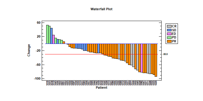
More: Ordered Waterfall Plots.pdf or Watch Video
Sequential Waterfall Plots are widely used to illustrate the cumulative effect of positive and negative contributions to a total value. Bars are drawn representing each contribution as well as totals and subtotals. Applications include financial analysis, inventory analysis, performance analysis, hiring, and demographics.
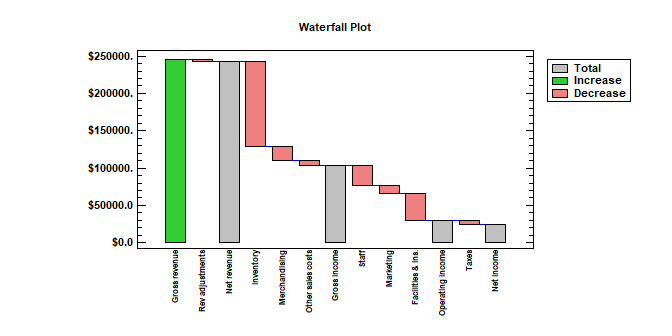 More: Sequential Waterfall Plots.pdf or Watch Video
Three Dimensional Waterfall Plots are widely used to display multiple columns of data versus a common variable. One commonly encountered example is a Cumulative Spectral Decay plot, in which spectra are plotted at multiple times to illustrate changes in amplitude as a function of both frequency and time. In general, the plots are used to show changes in a quantitative variable versus both time and some other factor.
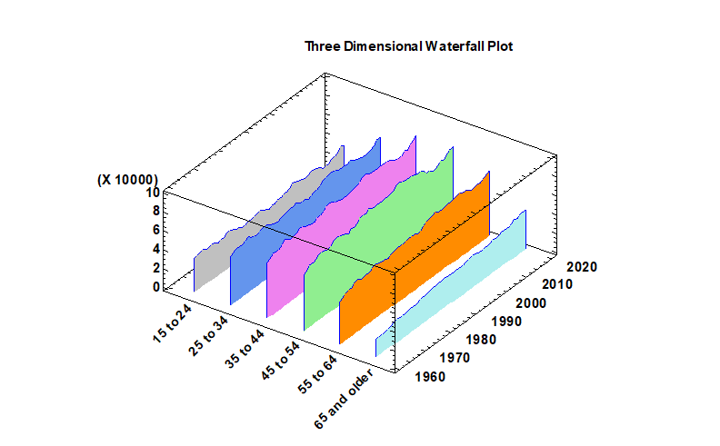
More: Three Dimensional Waterfall Plots.pdf or Watch Video
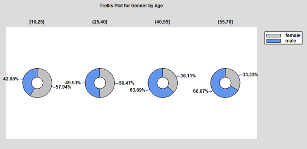
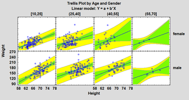
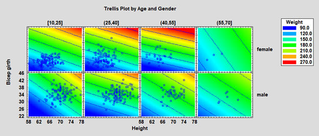
Trellis Plots are segmented plots that display data for each combination of one or more conditioning variables. The Numeric Y option creates either histograms, box and whisker plots or normal probability plots.
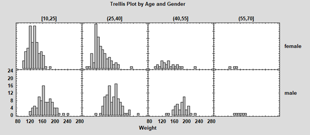
More: Trellis Plots.pdf
The Categorical Y option creates either barcharts, piecharts or donut charts.
The Y vs X option creates either scatterplots, regression curves or nonparametric smoothers.
The Z vs X and Y option creates either bubble charts, regression models or nonparametric smoothers.

© 2025 Statgraphics Technologies, Inc.
The Plains, Virginia
CONTACT US
Have you purchased Statgraphics Centurion or Sigma Express and need to download your copy?
CLICK HERE


