Statgraphics Centurion 19, released in 2020 and most recently updated in 2024, is the latest version of our flagship Windows desktop product. It is a major upgrade, adding many new features for statistical analysis, data visualization and predictive analytics. Highlights include a new user interface, important enhancements to the Design of Experiments Wizard, new machine learning procedures, a new accelerated life testing procedure, and methods for exchanging data and scripts with Python.

To discover what Statgraphics 19 has to offer: click the download button above, watch the video link below, check out the statistical capabilities listed in the left sidebar, or simply scroll through this page.
|
Version 19 New Features & Enhancements


|
Statgraphics 19 is a major upgrade that contains many new features, including:
|

User InterfaceSelection of options and procedures is now controlled by a ribbon bar and quick access toolbar.
The ribbon bar makes it easy to find the feature you're looking for, while the quick access toolbar lets you bypass the menus when using your favorite procedures. Analysis windows now let you switch between multi-pane and single pane modes. As in earlier versions, multi-pane mode puts each table and graph in a separate pane of a splitter window.
Single pane mode combines all output into a single report-style format.
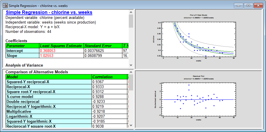
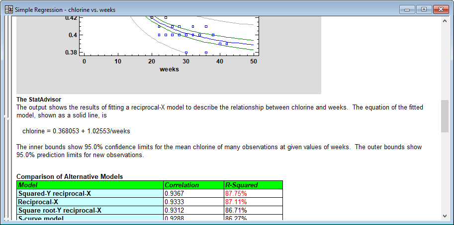
As can be seen above, output tables now have modifiable column and row headers that may be displayed using selectable colors and other features. |
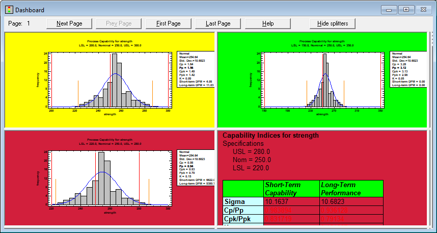
DashboardA new Dashboard has been added to the set of StatFolio windows that can display tables and graphs from different analyses side-by-side. For procedures such as control charts, capability analyses, regressions, stock charts and measurement studies, the background of a table or graph can be colored green, yellow or red to indicate the status of selected indices, large changes or unusual residuals. Watch Video
|
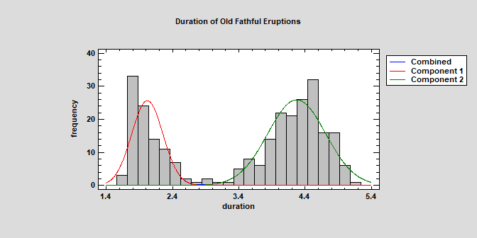
Univariate Mixture DistributionsThe Distribution Fitting (Univariate Mixture Models) procedure fits a distribution to continuous numeric data that consists of a mixture of 2 or more univariate normal distributions. The components of the mixture may represent different groups in the sample used to fit the overall distribution, or the mixture model may approximate some distribution with a complicated shape. The procedure fits the distribution, creates graphs, and calculates tail areas and critical values. Tools are provided for determining how many components are needed to represent a data sample. Watch Video
|
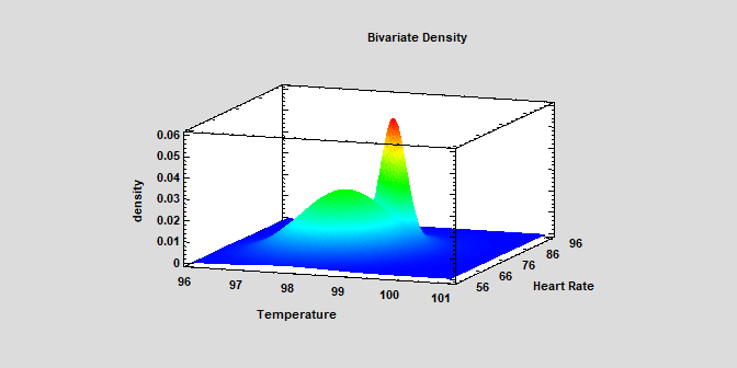
Bivariate Mixture DistributionsThe Distribution Fitting (Bivariate Mixture Distributions) procedure fits a distribution to continuous numeric data that consists of a mixture of 2 or more bivariate normal distributions. The components of the mixture may represent different groups in the sample used to fit the overall distribution, or the mixture model may approximate some distribution with a complicated shape. The procedure fits the distribution and creates graphs of the fitted model. Tools are also provided for determining how many components are needed to represent a data sample. Watch Video
|
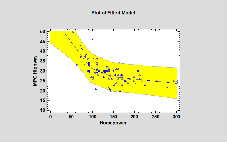
Piecewise Linear RegressionThe Piecewise Linear Regression procedure is designed to fit a regression model where the relationship between the dependent variable Y and the independent variable X is a continuous function consisting of 2 or more linear segments. The function is estimated using nonlinear least squares. The user specifies the number of segments and initial estimates of the locations where the segments join. The procedure then estimates the slopes, slope changes, and the locations at which the slope changes occur. Watch Video
|
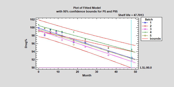
Stability StudiesStability studies are commonly used by pharmaceutical companies to estimate the rate of drug degradation and to establish shelf life. Measurements are typically made on samples from multiple batches at different points in time. Of primary interest is estimating the time at which the lower prediction limit from the degradation model crosses the lower specification limit for the drug. Depending on the structure of the data, batches may be treated as either a fixed or random factor. Watch Video
|
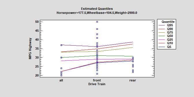
Quantile RegressionThe Quantile Regression procedure fits linear models to describe the relationship between selected quantiles of a dependent variable Y and one or more independent variables. The independent variables may be either quantitative or categorical. Unlike standard multiple regression procedures in which the model is used to predict mean response, quantile regression models may be used to predict any percentile. Median regression is a special case where the quantile to be predicted is the 50th percentile. Watch Video
|
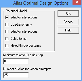
Alias Optimal Experimental DesignsNew Alias-Optimal designs generated by the DOE Wizard consider not only the precision in the estimated model coefficients but also potential bias in those estimates caused by active effects that are not in the assumed model. Criteria such as D-optimality do not take into account aliasing caused by omitted effects. Sometimes, alternative D-optimal designs may be subject to considerably different amounts of aliasing. At other times, a small reduction in the efficiency of the selected design may result in a large reduction in potential bias. Watch Video
|
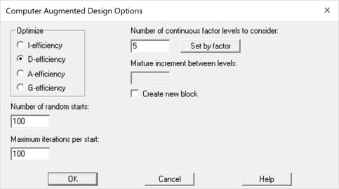
Optimal Augmentation of Existing Exp. DesignsA new feature added to the DOE Wizard is the ability to add runs to an existing experiment so as to maximize a selected optimality criterion. The user first selects the number of runs to be added and then completes the dialog box shown below. Watch Video
|
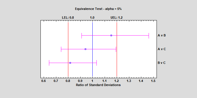
Equivalence Tests - Comparing VariancesNew procedures have been added for demonstrating the equivalence or noninferiority of population variances. One procedure compares the variance of a single sample to a target value, while the other compares the variances of samples taken from 2 different populations. In the second case, the samples are considered to be “equivalent” if the ratio of their respective standard deviations falls within some specified interval surrounding 1. Watch Video
|
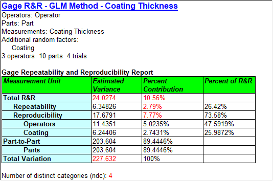
Gage Studies - GLM MethodThe GLM Method estimates the repeatability and reproducibility of a measurement system based on a study in which m appraisers measure n items r times. It also estimates important quantities such as the total variation, the precision-to-tolerance ratio, the standard deviation of the measurement error, and the percent of study contribution from various error components. In addition to variation introduced by appraisers and parts, additional factors may also be included. The additional factors may be treated as having either fixed or random effects. Note: This procedure will handle unbalanced data. Watch Video
|
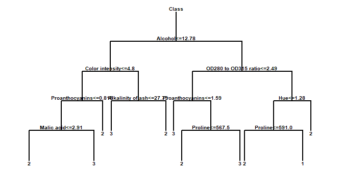
Decision ForestsThe Decision Forests procedure implements a machine-learning process to predict observations from data. It creates models of 2 forms:
The models are constructed by creating a large number of decision trees and averaging the predictions made from those trees. Many trees are constructed using a procedure similar to that of Classification and Regression Trees, with randomized node optimization and “bagging”. Watch Video
|
Zero-Inflated Count RegressionThe Zero Inflated Count Regression procedure is designed to fit a regression model in which the dependent variable Y consists of counts. The fitted regression model relates Y to one or more predictor variables X, which may be either quantitative or categorical. It is similar to the procedures for Poisson Regression and Negative Binomial Regression except that it contains an additional component that represents the occurrence of more zeroes that would be expected in those models. Data containing excess zeroes is very common, including such diverse examples as the number of days a student is absent from school, the number of insurance claims within a population where not everyone has insurance, the number of defects in a manufactured item, and wild animal counts. Watch Video
|
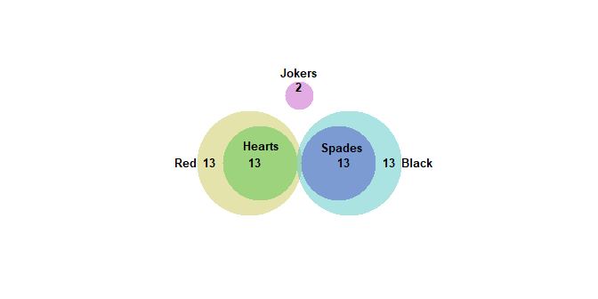
Venn and Euler DiagramsThe Venn and Euler Diagrams procedure creates diagrams that display the relative frequency of occurrence of discrete events. They consist of circular regions that represent the frequency of specific events, where the overlap of the circles indicates the simultaneous occurrence of more than one event. Watch Video
|
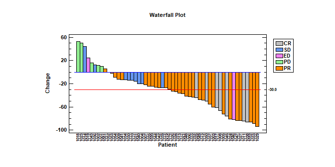
Waterfall Plots3 types of waterfall plots have been added to version 19: an ordered plot, a sequential plot, and a 3-dimensional plot. Ordered Waterfall Plots are used to illustrate how a variable of interest increases or decreases amongst a sample of individuals. Data values are sorted and plotted as a barchart, usually with respect to a baseline equal to 0. A reference line may be added to the plot to display a target value. Watch Video
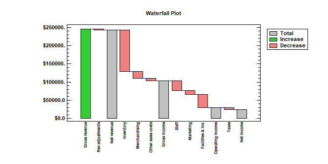
Sequential Waterfall Plots are used to illustrate the cumulative effect of positive and negative contributions to a total value. Bars are drawn representing each contribution as well as totals and subtotals. Applications include financial analysis, inventory analysis, performance analysis, hiring, and demographics.
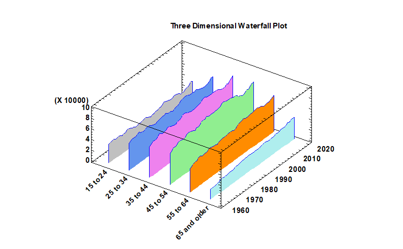
Three Dimensional Waterfall Plots are used to display multiple columns of data versus a common variable. One frequently encountered example is a Cumulative Spectral Decay plot, in which spectra are plotted at multiple times to illustrate changes in amplitude as a function of both frequency and time. In general, the plots are used to show changes in a quantitative variable versus both time and some other factor.
|
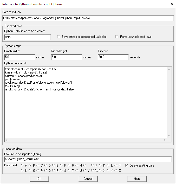
Python InterfaceVersion 19 adds an interface to the Python programming language that is similar to the interface to R that was added in Version 18. Procedures have been added that make it easy to pass data between Statgraphics and Python. Python scripts may also be written and executed from within Statgraphics. Watch Video
|
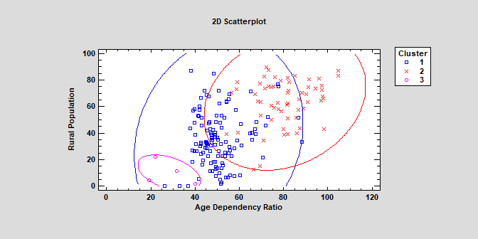
K-Means ClusteringThe K-Means Clustering procedure implements a machine-learning process to create groups or clusters of multivariate quantitative variables. Clusters are created by grouping observations that are close together in the space of the input variables.The calculations are performed by the “Scikit-learn” module in Python. Watch Video
|
New Probability DistributionsSeveral new probability distributions have been added to the list of distributions available for fitting data and generating random numbers: 1. The zero-inflated Poisson distribution. Watch Video 2. The zero-inflated negative binomial distribution. 3. The Johnson family of SB, SL and SU distributions. Watch Video
|
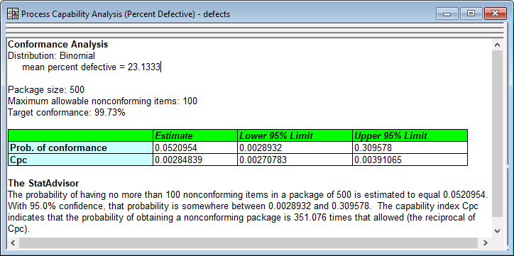
Conformance Analysis for Attribute CapabilityConformance analysis has been added to the procedures for determining capability based on attribute data. Conformance analysis is used to determine how well a process conforms to specifications stated in terms of the number of nonconforming items per package. Watch Video
|
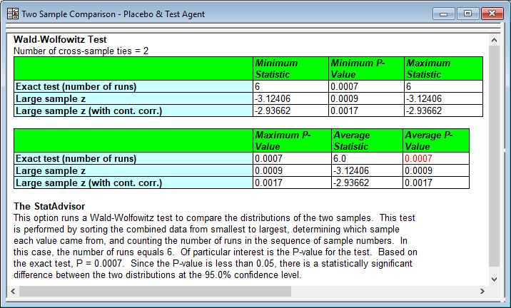
New Statistical TestsSeveral new statistical tests have been added to existing statistical procedures: 1. Levene's test for comparing the variances of multiple samples. 2. The Wald-Wolfowitz test, which tests the hypothesis that 2 independent samples come from the same population. 3. The Games-Howell Post-Hoc multiple comparisons test in the Oneway ANOVA procedure.
|
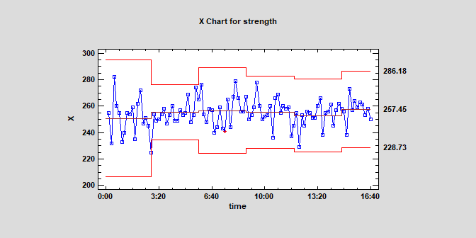
Statistical Process Control ChartsThe number of recalculation points for the control limits has been changed from 4 to 9.
|
Missing Data PlotA plot has been added to the Data Viewer to show the location of missing data in a data set.
|
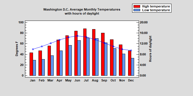
BarchartsAn optional line may now be added to simple and multiple barcharts. Watch Video
|
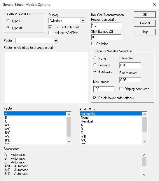
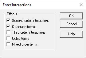
General Linear ModelsStepwise variable selection has been added to the GLM procedure for both quantitative and categorical factors. In addition, entry of interactions and other high-order terms has been simplified. Watch Video
|
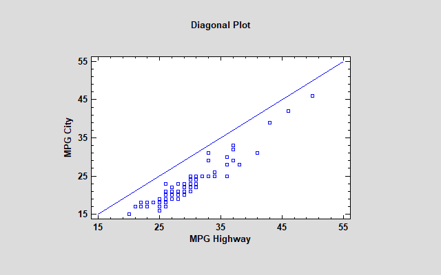
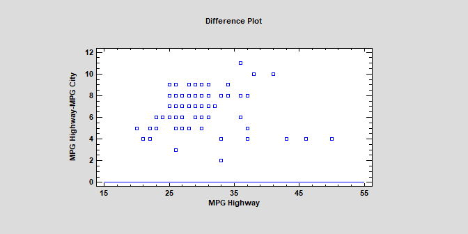
Paired Sample Comparisons2 new diagnostic plots have been added to the Paired Sample Comparison procedure. The first is a Diagonal Plot that plots the paired values with a diagonal line.
The second plots the residuals from the line Y=X.
|
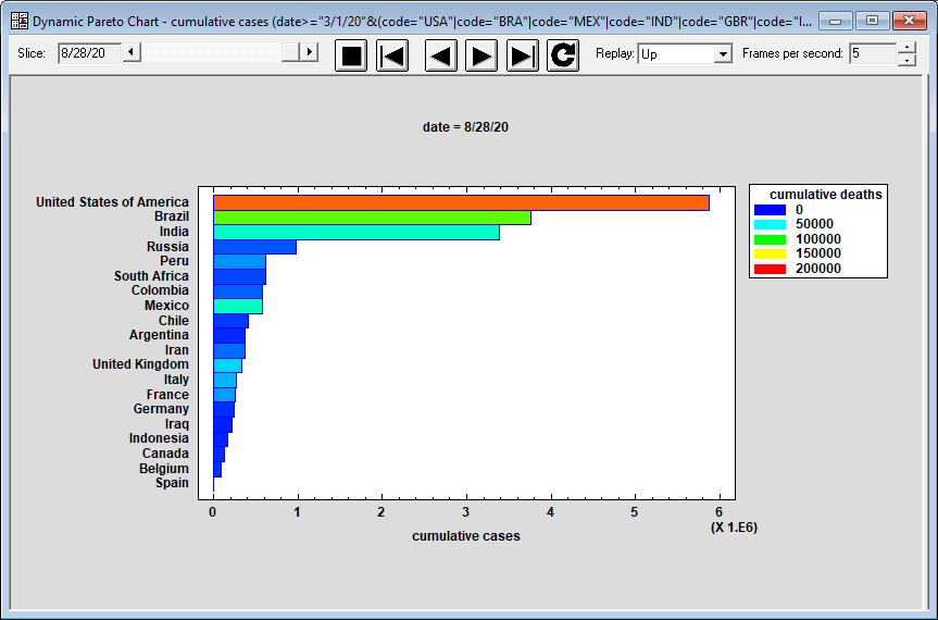
Dynamic Pareto ChartThe Dynamic Pareto Chart Statlet is designed to create a Pareto chart that shows how data corresponding to a set of categories changes over time. Given data representing n categories observed over p time periods, the procedure shows a multiple barchart in which the categories have been sorted from greatest to least. The chart evolves over time, with categories switching places when the sort order changes. Bars may be colored to represent an additional variable.
|
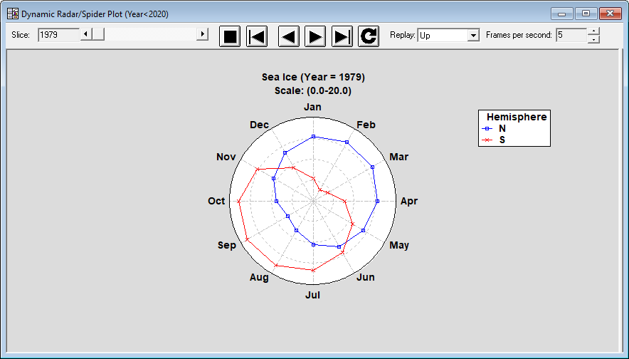
Dynamic Radar/Spider PlotThe Dynamic Radar/Spider Plot Statlet is designed to show how data corresponding to a set of categories or variables change over time. The input data consist of k columns representing p time periods. The program generates a dynamic display that illustrates how each of the columns changes. Typical applications include plotting monthly sales or other data containing strong seasonal effects. The basic chart plots values on a circular grid in which each spoke represents a separate variable or characteristic. Points on the plot are connected for each sample displayed. As time is advanced, changes in the patterns can be easily visualized.
|
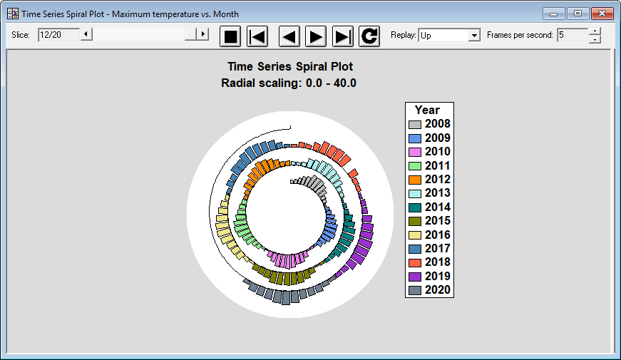
Time Series Spiral PlotThe Spiral Plot Statlet plots time series data along an Archimedean spiral that starts near the center of the plot and spirals outward. It is particularly helpful for displaying large amounts of data that exhibit a seasonal pattern. Data may be shown using bars, point, or lines. It is implemented as an animated Statlet that dynamically changes with time.
|
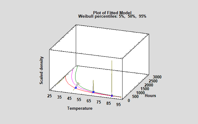
Accelerated Life TestingVersion 19.6 of Statgraphics introduced a new procedure for accelerated life testing. The procedure fits various models to observed failure times collected under higher than normal levels of one or more stress variables. The fitted models are then extrapolated to estimate the failure time distribution under normal operating conditions. The new procedure estimates 6 common acceleration models, including Arrhenius, Eyring and inverse power models. Failure times are assumed to follow one of 7 distributions, including the Weibull, lognormal and smallest extreme value distributions. The data analyzed by the new procedure consists of observed failure times, which may be censored. The procedure supports any combination of right-censored, left-censored, or interval-censored data.
Support Vector MachinesThe Support Vector Machines procedure implements a machine-learning process to predict observations from data. It creates models of 2 forms: Classification models that divide observations into groups based on their observed characteristics; and Regression models that predict the value of a dependent variable. In the case of Support Vector Classifiers (SVC), algorithms attempt to divide observations into groups by generating gaps between the groups that are as wide as possible. In Support Vector Regression (SVR), algorithms attempt to minimize the coefficients of a model in which the distance of observations from a region around the fitted model defined by an acceptable amount of error is as small as possible.
|
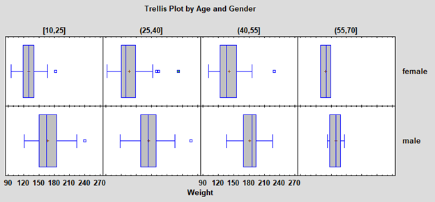
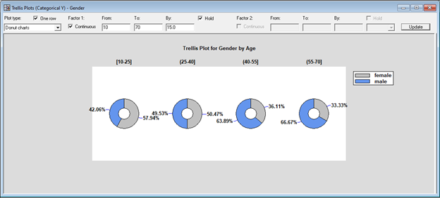
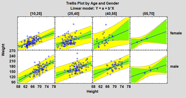
Trellis PlotsTrellis Plots are segmented plots that display data for each combination of one or more conditioning variables. For example, box-and-whisker plots showing the distribution of weight among individuals might be displayed side-by-side for men and women of different ages. The plots are designed to help users visualize how data change across levels of the conditioning variables. Four types of trellis plots are provided: 1. Trellis plots for numeric variables
2. Trellis plots for categorical variables
3. Trellis plots for Y versus X
4. Trellis plots for Z versus X and Y
|
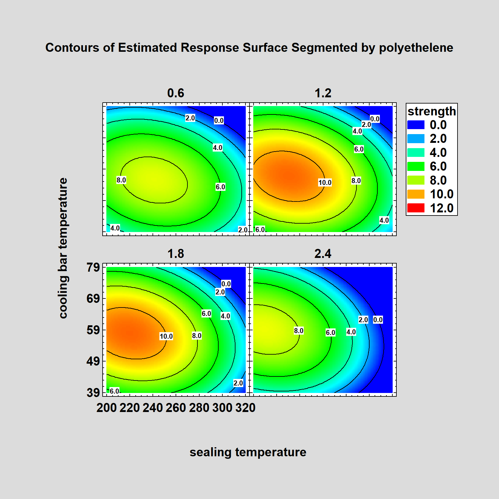
Other ChangesNew options have been added throughout the program. 1. The ability to undo several consecutive operations in the data editor. 2. The ability to reverse the order of the rows in a datasheet. 3. The ability to save images contained in the StatGallery as image files. 4. The ability to save graphs with a transparent background. 5. The ability to change the point size when saving graphs. 6. New one-sided prediction limits for Calibration Models. 7. Optional lines separating clusters on a dendrogram. 8. The ability to optimize only selected responses in the DOE Wizard. 9. New residual probability plots in many procedures. 10. Optional input of data and code columns in radar and spider plots. 11. Direct data import from Minitab project files, SAS transport files, and SPSS portable files. 12. Improved response surface plots, allowing lines and labels to be added to continuous contour plots. 13. Trellis plots added to model fitting procedures in DOE wizard. 14. Logit, probit and Box-Cox transformations added to available transformations in DOE wizard. 15. Colored background now available for all graphics text. 16. New option added to academic site license activation to support both virtual and non-virtual classrooms. |

Copyright 2020, Statgraphics Technologies, Inc. |

© 2025 Statgraphics Technologies, Inc.
The Plains, Virginia
CONTACT US
Have you purchased Statgraphics Centurion or Sigma Express and need to download your copy?
CLICK HERE